The Bfresh concept by Blink combines a food hall, convenience retail and a restaurant.
CLIENT
Bfresh
LOCATION
United States
INDUSTRY
Foodhall retail
SCOPE
Store concept

Store concept


Bfresh is a pioneering concept that redefines the neighborhood market by combining a food hall, restaurant, and local convenience store—all seamlessly integrated with e-commerce capabilities. This innovative approach is specifically designed for urban, value-seeking food enthusiasts, offering them a unique blend of fresh food, smart value, and exceptional food service.
Bfresh is an innovative concept for the U.S. market, exemplifying the notion of "new value" by offering high-quality fresh products at affordable prices within a carefully designed and relevant shopping environment. The store resonates with urban, food-interested value hunters who are well-versed in food quality, origin, and pricing, making Bfresh a trendsetter in the retail industry.
Customer overview: Ahold USA, a major food retailer operating approximately 770 supermarkets across 13 states, sought to capture the growing market of "food-interested, urban value-hunters" who are highly informed about food and willing to shop online.
Blink's Role: Blink was tasked with developing a comprehensive solution encompassing brand strategy, naming, big idea, architecture, merchandising, visual identity, packaging design, and communication across both physical and digital channels.
Bfresh's concept is rooted in Blink’s insight that food is the new fashion, deeply intertwined with urban culture. By combining great fresh food, smart value, and local convenience, Bfresh offers a fresh market experience that creates significant value for its customers.


The fundamental problem was simple yet devastating: grocery shopping had become a chore. For the target demographic of "urban value-hunters," the traditional supermarket was a fluorescent-lit purgatory of endless aisles and lackluster deli counters. The challenge wasn't just about declining foot traffic; it was about an outdated store format that failed to communicate with a generation that views food as a form of cultural currency.
Our team, celebrated as store interior design specialists, faced a multi-layered puzzle. How do you convince a customer, who is used to ordering dinner via an app, to walk into a physical space? How do you merge the low-margin reality of a grocery store with the high-energy vibe of a trendy food hall? We needed to solve the disconnect between "value pricing" and "premium experience." The client needed a concept that offered the convenience of a corner store, the quality of a farm stand, and the social buzz of a fast-casual restaurant. If that sounds like a paradox, that’s because it is.
.webp)

Before we sketched a single floor plan, we dove deep into the psyche of the target consumer. As a retail design agency in Sweden working globally, we applied our rigorous research methodology to the US market. We mapped customer journeys, stalked food bloggers (professionally, of course), and analyzed the friction points of city living. Here is what we found.
We discovered that for the urban dweller, what they eat is as expressive as what they wear. Food isn't just fuel; it's a status symbol and a conversation starter. The store couldn't just be a warehouse for goods; it had to be a stage for culinary trends. The design needed to reflect the aesthetics of fashion retail rather than traditional grocery.
Our research shattered the myth that "value shoppers" only care about the lowest price. This specific demographic is hyper-informed. They know the origin of their coffee beans and the season for kale. They want high quality, but they refuse to overpay. They are looking for "smart value"—premium feel without the premium price tag.
We realized the customer’s needs changed drastically depending on the hour. The morning persona is rushing for caffeine and a bagel. The lunch persona needs a quick, healthy escape. The evening persona wants to unwind, perhaps grab a meal to heat up, or shop for a dinner party. A static store environment would fail two out of three of these personas. The space needed to be alive.

.webp)


From Strategy to Execution
Our strategy was to destroy the walls between a grocery store, a restaurant, and a neighborhood hangout. We termed this strategic pivot "Freshify Your Life." As Scandinavian retail design experts, we approached this with a philosophy of functional beauty. We decided that Bfresh (the name we developed) would not compete with supermarkets; it would compete with takeout apps and trendy cafes.
The core of our strategy was the "Grocerant" concept—a hybrid engine where the food hall wasn't an afterthought, but the main attraction. Everything had to be made from scratch, in-store, every single day. Visually, we moved away from the corporate "cleanliness" of US chains and embraced a raw, honest aesthetic. We leveraged our reputation as a European retail design studio to introduce a tone of voice that was cheeky, direct, and transparent. We stopped treating the customer like a consumer and started treating them like a neighbor.
Spatial Layout & Customer Flow
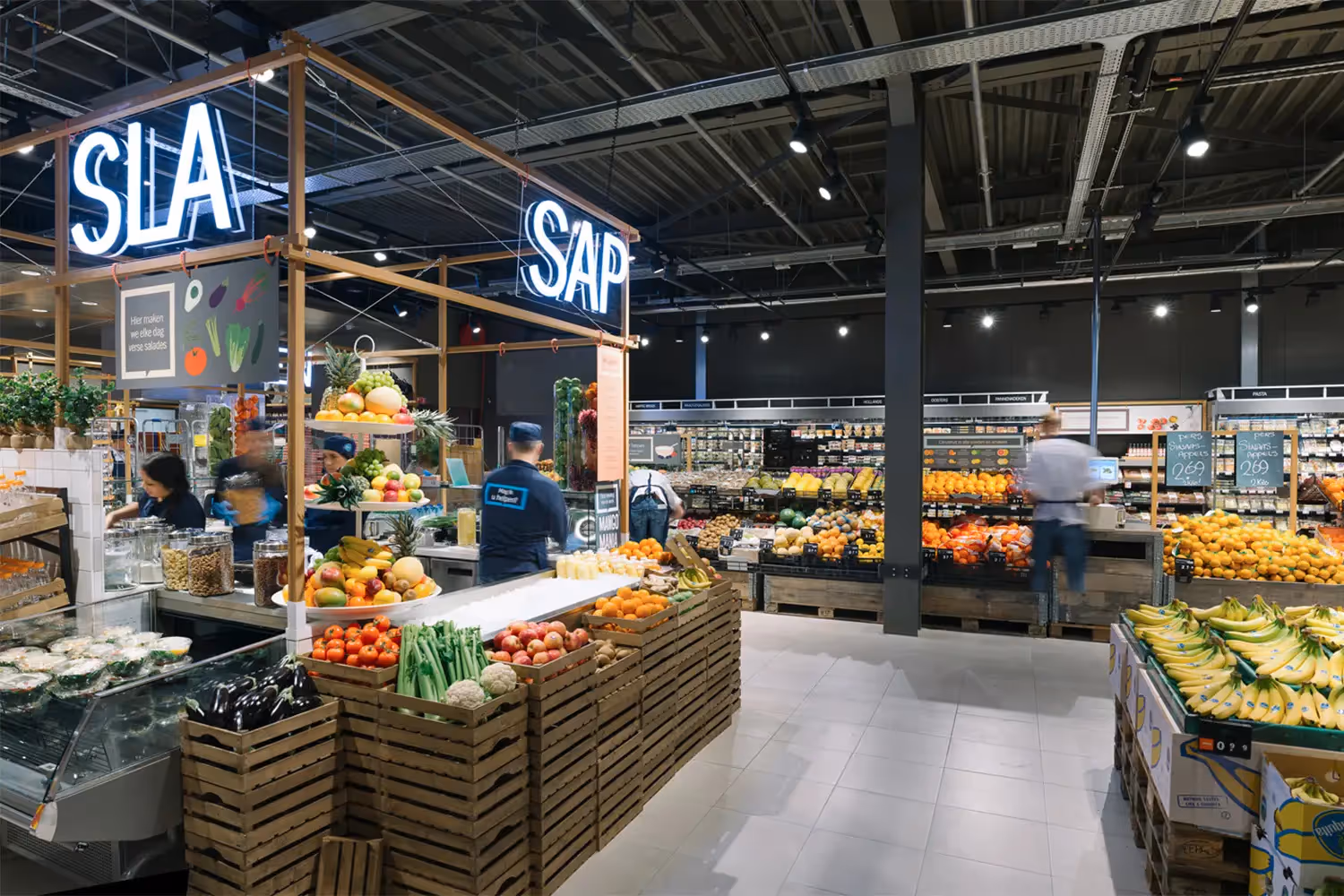
We abandoned the grid. The layout was designed to encourage exploration rather than efficiency. We placed the "Fresh Kitchen"—the heart of the store where chefs prepared meals—front and center. This created immediate theater and sensory engagement (smell is a powerful sales tool) the moment a customer walked in.
Category Messaging & Signage
We utilized a "playful value" approach to graphics. Instead of dry aisle markers, we used witty, illuminated typography that guided the customer with a smirk. The messaging was bold and conversational, using a tone of voice that felt like a friend recommending a product, not a corporation pushing SKU.
Lighting & Atmosphere
This was our pièce de résistance. We implemented an adaptive lighting system—a technique rarely seen in grocery retail but common for a high-end retail design agency in Sweden. In the morning, the store is flooded with cool, crisp light to mimic daylight, emphasizing freshness. As the day progresses, the lighting softens. By 5 PM, the store transitions into "evening mode": lights dim, spotlights focus on displays, and the ambient music shifts to house beats. It transforms from a market into a club-like atmosphere, perfectly matching the urban evening vibe.
Materials & Sustainability
We utilized raw materials—concrete, untreated wood, and steel—to convey authenticity. No fake plastic veneers. This not only looked better but communicated the "nothing to hide" philosophy of the food sourcing.
Digital Integration
We integrated digital touchpoints seamlessly. From digital menu boards that updated in real-time based on ingredient availability to e-commerce integration that allowed for "click and collect" without disrupting the in-store flow.
Executing a concept this ambitious across the Atlantic presented unique hurdles. As retail concept design in the Nordics practitioners, we are used to strict timelines and high precision. Bringing this to the US required intense collaboration.
One major challenge was the operational shift for the client. Ahold was used to stocking shelves, not running a commercial kitchen. We had to design fixtures that were not only beautiful but durable enough for heavy food service use. We worked closely with local contractors to ensure the "raw" look didn't feel "unfinished." The changing lighting system required complex programming to ensure the transition was subtle and subconscious, rather than jarring. We managed the entire scope, from the architectural shell down to the packaging design on the sandwich wrappers, ensuring a cohesive brand voice that shouted "Bfresh" at every touchpoint.

The launch of Bfresh established a new benchmark for urban grocery retail. We helped Ahold USA successfully capture the elusive millennial market. The concept resonated instantly with the target demographic. Customers didn't just shop; they hung out. The "Freshify Your Life" mantra became a tangible lifestyle. The evening transition proved to be a massive hit, turning the mundane task of picking up dinner into an enjoyable social ritual.
Bfresh proved that a legacy retailer could pivot and innovate. The store concept succeeded in blurring the lines between food service and retail, creating a high-margin model that competitors are now scrambling to replicate. Client Satisfaction Ahold USA gained a foothold in urban centers where their traditional big-box format could never fit. The project stands as a testament to the power of design. We didn't just build a store; we built a neighborhood hub.


.webp)