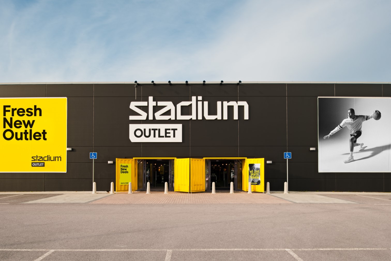
Albert Heijn is not just a supermarket chain; in the Netherlands, it is an institution. With a commanding market presence and a legacy of serving millions, they are the undisputed heavyweights of Dutch grocery retail. However, heavyweights cannot afford to be slow on their feet. They approached us—Blink, a premier retail design agency in Sweden—because they recognized a shift in the wind. The era of purely transactional shopping was fading.
They needed a partner who understood that modern consumers don't just want to buy ingredients; they want to be inspired by them. They sought our perspective as Scandinavian retail design experts to reimagine their "XL" format—their largest footprint stores. They didn't just want a renovation; they wanted a revolution in how customers perceive the weekly shop, moving from a chore to a gastronomic event.


The core problem with "XL" stores, historically, is that they can feel like warehouses with better lighting. The sheer scale often alienates the shopper, turning the journey into a logistical mission to retrieve items and escape. Albert Heijn faced the challenge of "soulless volume." They possessed the square footage, but they lacked the intimacy and the sensory engagement of a traditional market square.
As a European retail design studio that thrives on solving complex spatial puzzles, we identified several friction points. The existing format suffered from rigid grid layouts that stifled exploration, lighting that flattened the visual appeal of fresh produce, and a lack of "human" moments within the vast aisles. The challenge was to take a massive industrial footprint and inject it with the warmth, smell, and visual delight of a boutique food hall, without sacrificing the efficiency required for high-volume retail. We needed to stop people from autopilot shopping and get them to look up, smell the bread, and stay a while.
Before we drew a single line, we had to understand the "why" behind the buy. As store interior design specialists, we know that assumptions are the enemy of innovation. We conducted deep-dive audits and mapped customer journeys to uncover the psychological triggers of the Dutch shopper.

Our research indicated that modern consumers are increasingly skeptical of pre-packaged opacity. They crave transparency. We discovered that when customers see food being prepared—chopped, kneaded, grilled—their perception of freshness skyrockets. If the kitchen is hidden, the trust is lower. If the kitchen is the stage, the food becomes the star.
We utilized heat-mapping and dwell-time data to realize that shoppers were rushing through fresh sections because the environment felt sterile. The lighting was often too cool (blue-hued), making red meats look dull and bakery items look cold. We realized there was a "sensory gap"—the food tasted better than the store looked. To bridge this, we needed to manipulate the environment to match the quality of the produce.
In standard layouts, efficiency is king, often at the cost of discovery. Shoppers walked straight lines. We found that by disrupting the linear flow with "islands of interest", we could encourage a meandering path. This wasn't about confusing the customer (nobody likes getting lost in the pasta aisle), but about creating "pause points" that invited curiosity rather than just facilitating movement.
Our strategy was rooted in the concept of "The Contemporary Food Hall". We decided to flip the script on the traditional grocery hierarchy. Instead of walls of product surrounding the customer, we wanted to pull the product into the center of the room.
As a retail concept design in the Nordics agency, we brought our signature philosophy to the table: functional beauty. The strategy was to dismantle the "us vs. them" barrier between staff and shoppers. We proposed bringing the preparation areas out from the back of the house and dropping them squarely in the middle of the high-traffic zones.
This wasn't just aesthetic; it was a commercial strategy. By elevating the perceived value of fresh items through better presentation, we could justify a premium positioning and increase basket size. We aimed to create a hybrid space—part efficient supermarket, part bustling marketplace. We approached this differently from competitors by focusing less on "signage" and more on "sightlines". We wanted the food itself to be the navigation beacon.
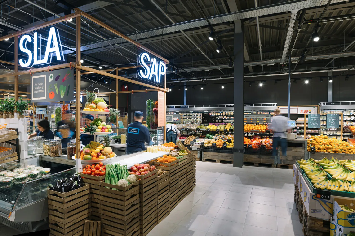

We obliterated the traditional long aisles in the fresh departments. In their place, we installed dynamic "Island Stalls". These free-standing units broke up the monotony of the floor plate, allowing 360-degree access to produce. This encouraged a meandering flow, mimicking the organic movement found in outdoor farmers' markets.
We integrated fully functional preparation stations directly onto the sales floor. This included a sushi bar and an artisanal pizza oven. These weren't just counters; they were stages. We lowered the barrier heights to ensure customers could see the chefs’ hands at work, creating an immersive experience of craft and freshness.
Lighting is the unsung hero of retail concept design in the Nordics. We implemented a sophisticated, layered lighting plan. We moved away from uniform washing and utilized high-contrast spot lighting with specific color temperatures. We used warmer, golden temperatures (2700K-3000K) for the bakery and cheese sections to evoke comfort, and crisp, high-CRI (Color Rendering Index) lights for produce to make the greens pop and the reds vibrate. It’s subtle, but it makes a bell pepper look like a jewel.
To counter the "warehouse" feel, we introduced a palette that felt domestic yet durable. We utilized warm wood tones, matte stone finishes, and ceramic tiling that echoed traditional Dutch kitchens. This warmth softened the industrial shell of the XL format, making the vast space feel intimate.
We designed the layout to maintain long, clear sightlines. By keeping the center-store fixtures lower, a customer standing at the entrance could see the deli, the bakery, and the produce simultaneously. This visual permeability reduced anxiety and made the store feel open and welcoming, rather than claustrophobic.
We didn't just stick screens on walls. We integrated interactive displays into the island stalls that offered recipe inspiration based on the produce right in front of the customer, blending the physical and digital seamlessly.
Turning a concept into reality in a live retail environment is never a walk in the park. As a European retail design studio operating at this scale, we faced the logistical challenge of retrofitting these "Food Hall" elements into existing operational structures.
Coordinate with architects, contractors, and the Albert Heijn operational teams was critical. One significant hurdle was the installation of the cooking stations; venting pizza ovens in the middle of a sales floor required ingenious HVAC solutions that didn't ruin the aesthetic ceiling line. Furthermore, ensuring the specific materials we selected met the rigorous hygiene standards of a high-volume food retailer required several rounds of prototyping and material testing.
We worked iteratively, prototyping the island stalls to ensure they could handle the restocking volume without blocking customer flow. The result was a robust, operational machine that looked like a boutique design hotel.

Critically, the design has been lauded by the industry and customers alike. Archello described the project as “A contemporary, forward-looking food market hall", validating our strategic pivot away from the traditional supermarket aesthetic. But the real win is the customer experience; navigation is intuitive, the atmosphere is welcoming, and the brand perception has shifted from a place to buy food, to a place to enjoy food. As a retail design agency in Sweden, we pride ourselves on results that look good and sell better. This project stands as a testament to the power of design in redefining the grocery landscape.
The proof, as they say, is in the artisanal pizza. The transformation of the Albert Heijn XL format has been nothing short of spectacular. By applying our store interior design specialists methodology, the new concept has rolled out to 37 XL stores, solidifying a massive 34.8% market share in Holland. Significant increase in "fresh" category sales due to improved presentation.
Increased dwell time in the fresh food zones. Higher conversion rates on prepared foods (sushi/pizza) attributed to the "theatre" of cooking.
richard@blinkthedesignagency.com
+46 73 545 5018
Blink is a leading retail design agency based in Sweden, specializing in retail concept development, store experience design, and omnichannel integration across the Nordics and Europe. We transform brands into physical destinations that drive both emotional connection and commercial performance.
.webp)