Blink’s retail and brand design for Stadium Outlet redefines what an outlet can be in the sports segment. Our starting point wasn’t price — it was attitude.

  • CLIENT

    STADIUM OUTLET

  • LOCATION

    NORDIC

  • INDUSTRY

    Specialty retail/Sports retail

  • SCOPE

    Retail concept, Brand identity, In-store communication, Retail experience

Opportunity and concept

Cross Icon

Stadium Outlet is not a “discount chain.” It’s a fast-moving trading machine: retail rebels working with limited, high-quality branded stock that arrives in shipping containers and moves quickly in and out of the store. When it’s gone, it’s gone. We built the entire concept around that truth.

Instead of hiding the warehouse, we celebrate it. The store looks and behaves like what it really is: a high-energy flow of products, value, and opportunity. Containers become landmarks in the space. Pallet racking becomes architecture. Bulk becomes theatre.

At the same time, we created a bold brand layer that speaks with the voice of a movement, not a campaign. The visual language draws from rebellious counter-culture — protest posters, music festivals and improvised sports arenas. Black-and-white, grainy photography. Urgent typography. Bold slogans taped straight onto walls and fixtures.

So the offer becomes more than “cheap sports gear.” It becomes: “Join the movement. Get it now, before it's gone.”

Result and impact

Cross Icon

The concept helped position Stadium Outlet as one of the Stadium Group’s most profitable and fastest-growing businesses. More importantly, it changed how 'outlet' is perceived in sports retail. We moved Stadium Outlet away from apologetic discounting and into confident access: real brands, real product, real opportunity — right now.

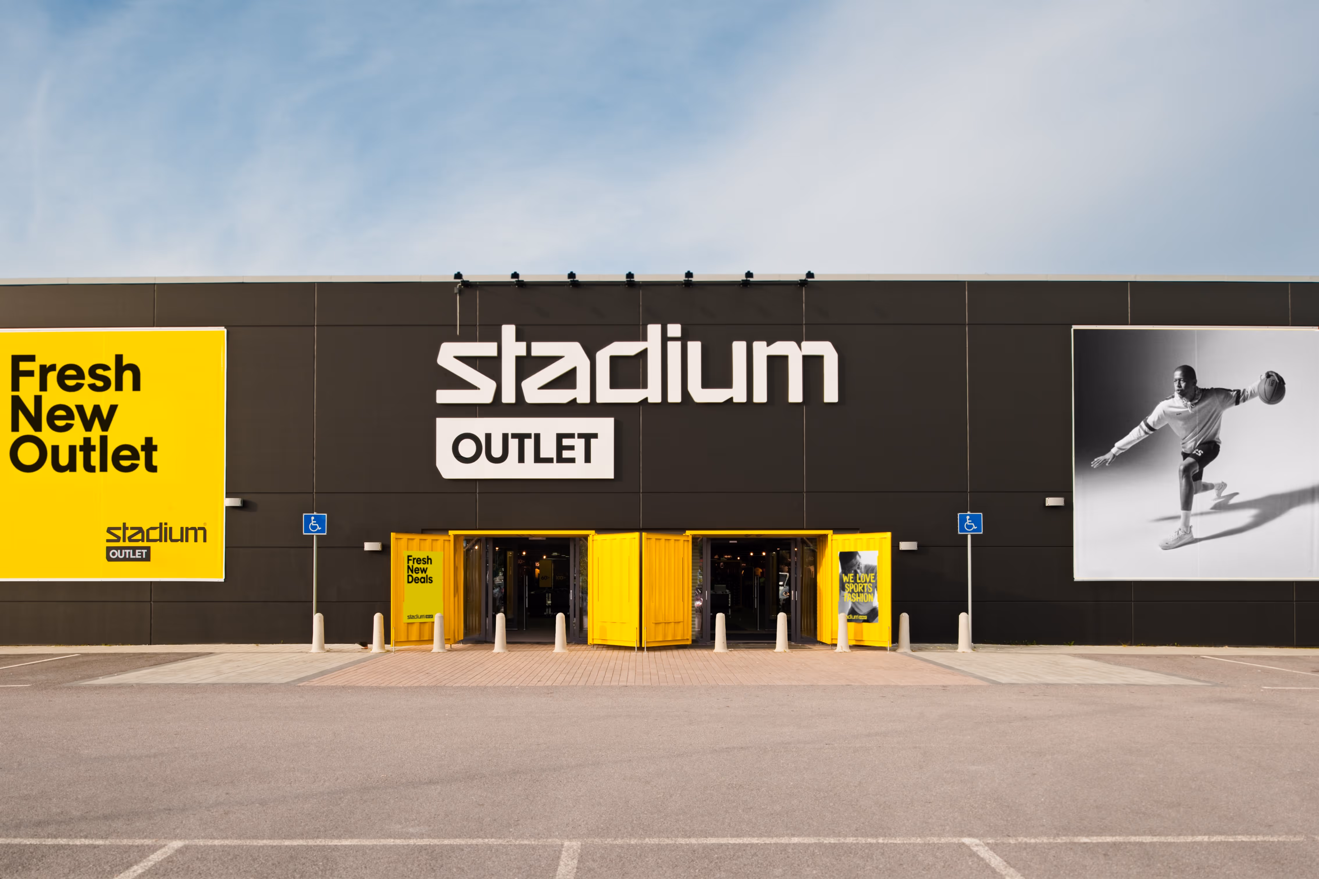
Visually, Stadium Outlet is no longer a stripped-down version of Stadium. It stands on its own, with its own volume, its own body language, its own voice. It feels entrepreneurial, energetic, unpolished in the best possible way.

Operationally, the system is built for rollout. The same core building blocks can be repeated across stores and countries without losing identity. Containers, pallet racking, taped messaging and oversized graphic statements.

In other words. This is not just a nice concept store. This is a scalable commercial format with a recognisable brand presence.

Key concept features
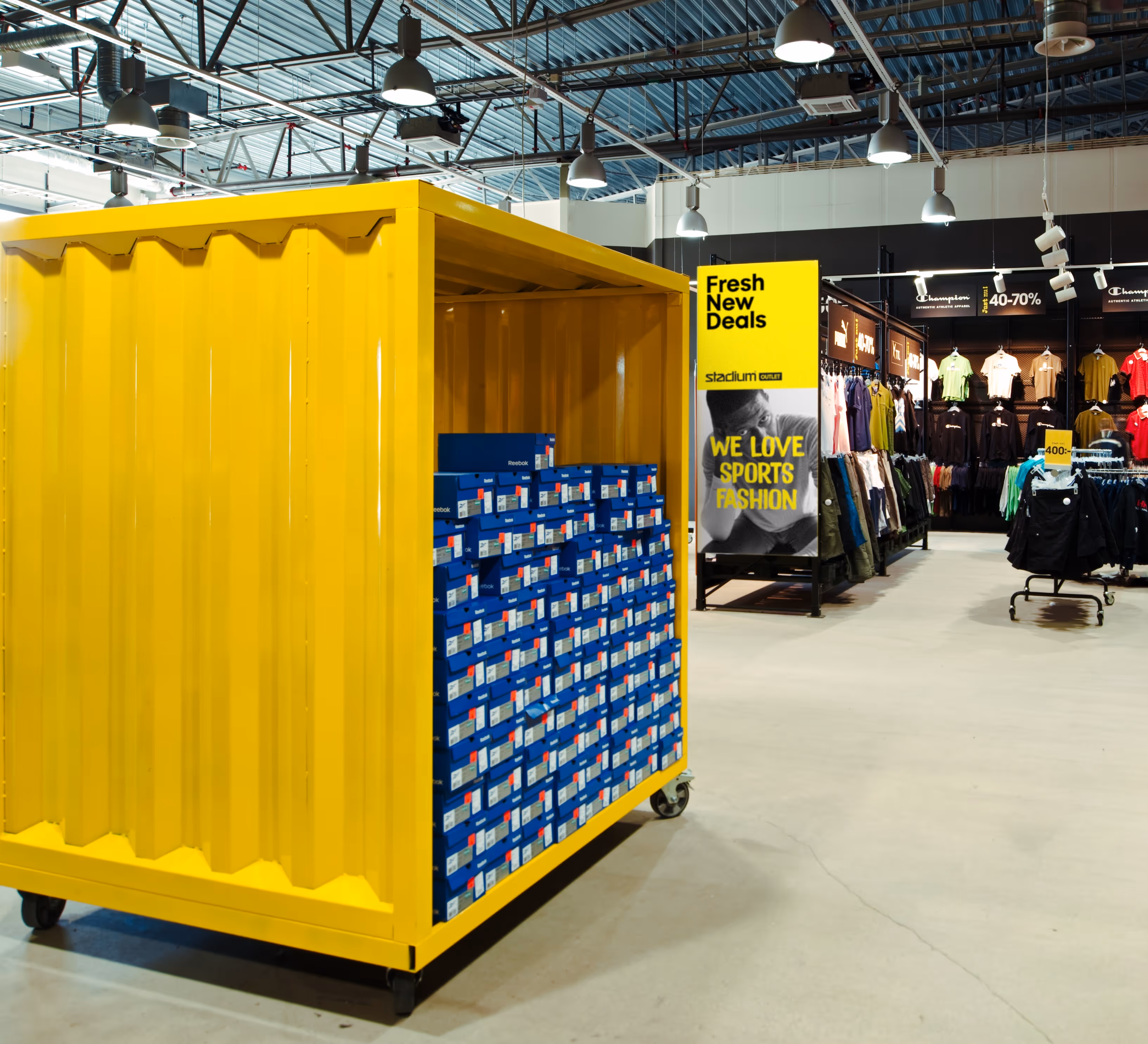
Container displays

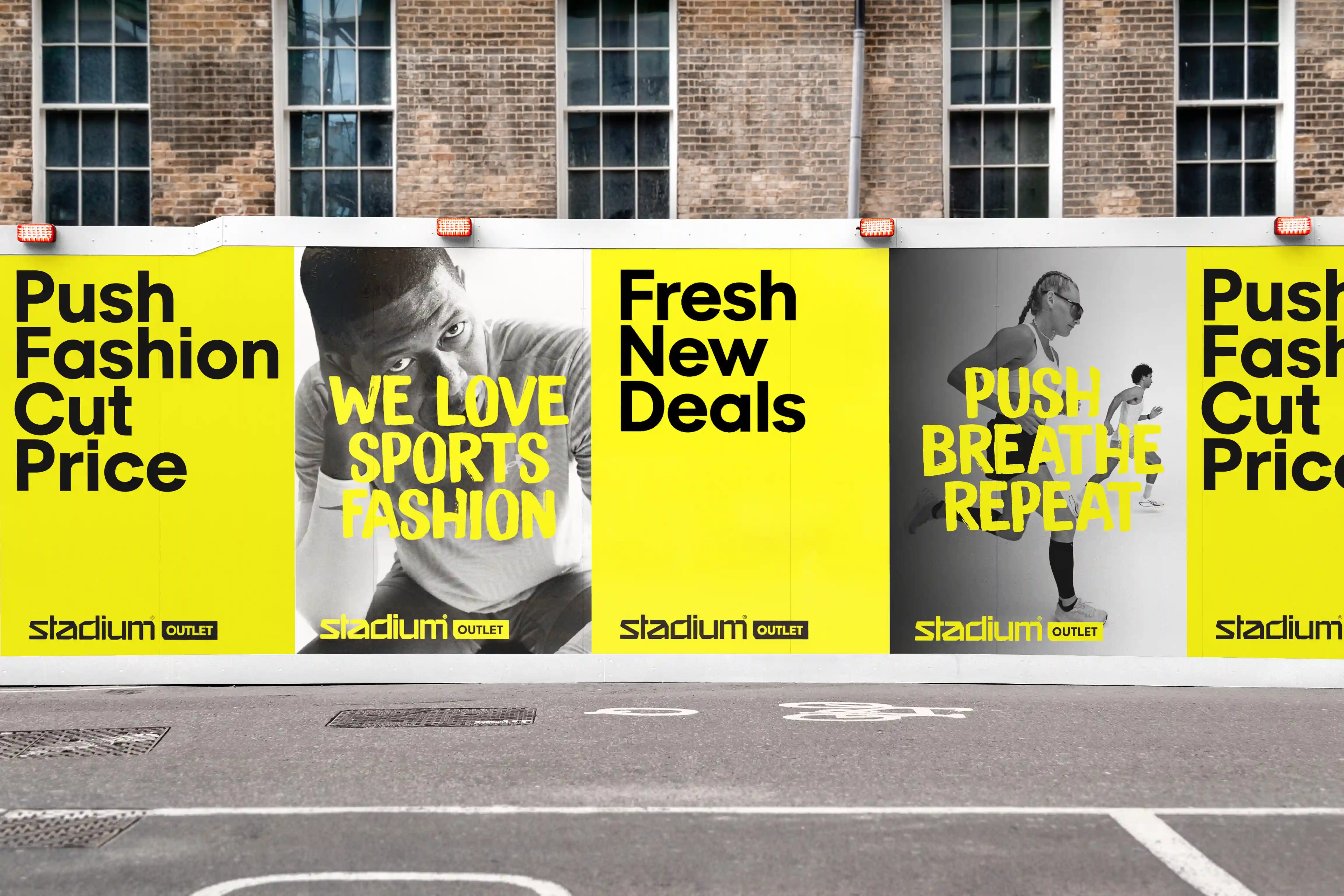
We turned incoming container loads into storytelling. The container isn’t backstage logistics anymore — it’s part of the customer experience. It signals urgency, scale, credibility: “This just landed.” It also lets the store feel like a drop, not a planogram.

Pallet racking architecture

We keep pallet racking exposed and proud. It creates a raw, urban, athletic attitude and instantly communicates honesty: “We’re not overspending on fixtures. That’s why you’re getting branded performance gear at this price.” It’s both visual signature and capex control.

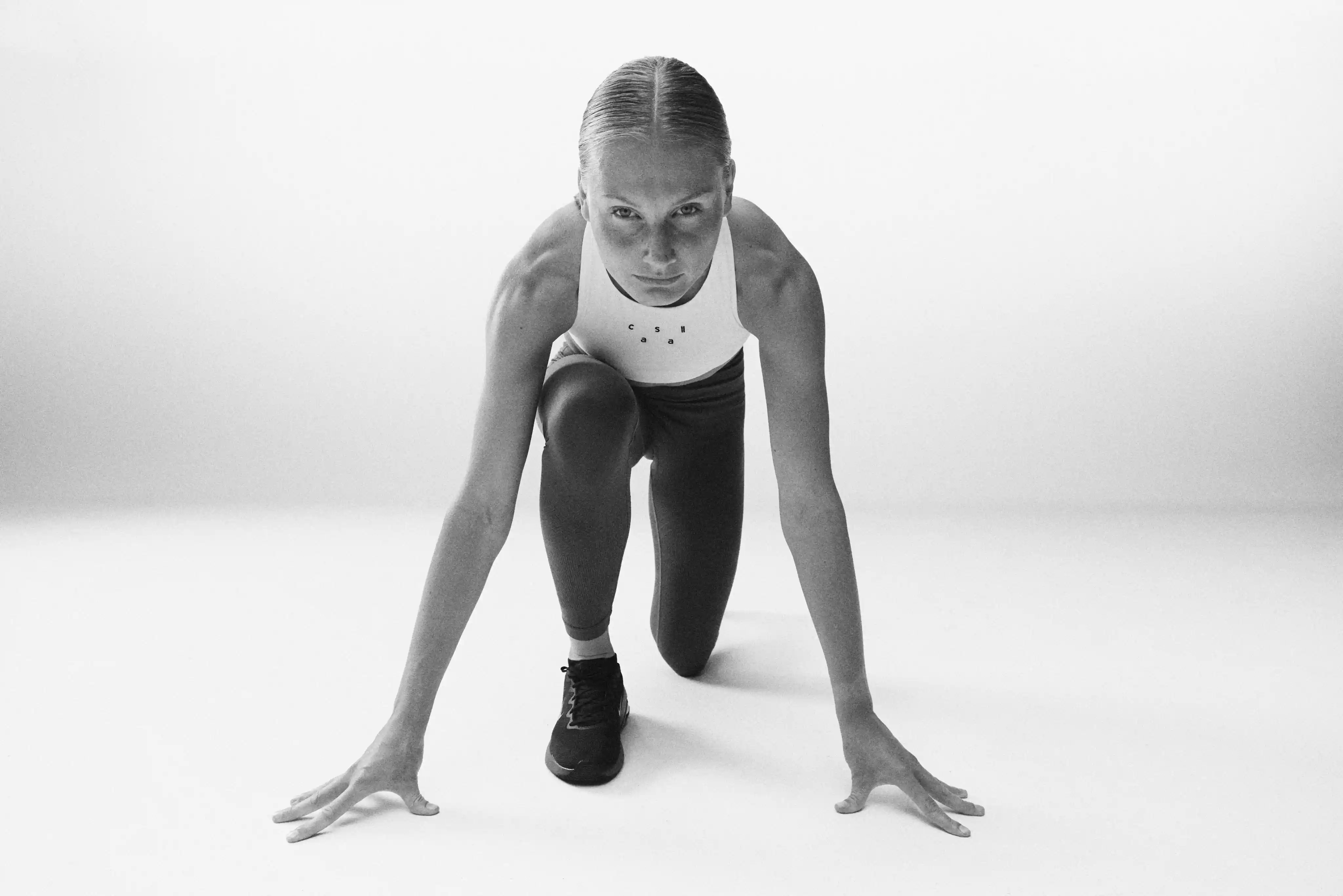
Brand identity with a rebellious sports attitude

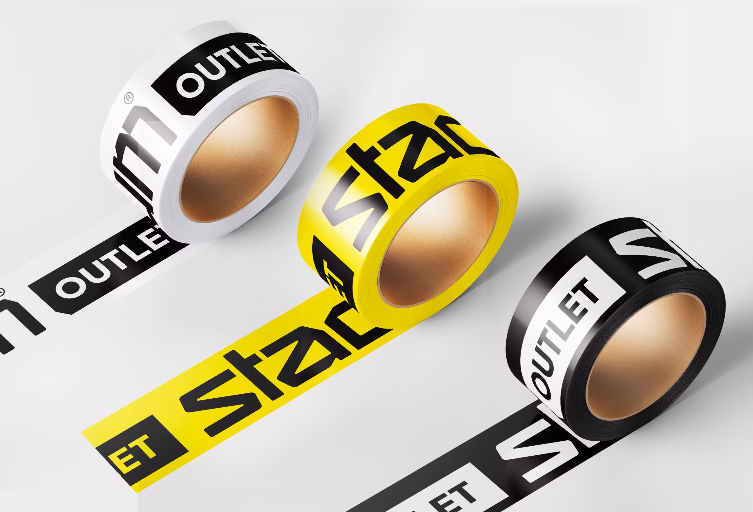
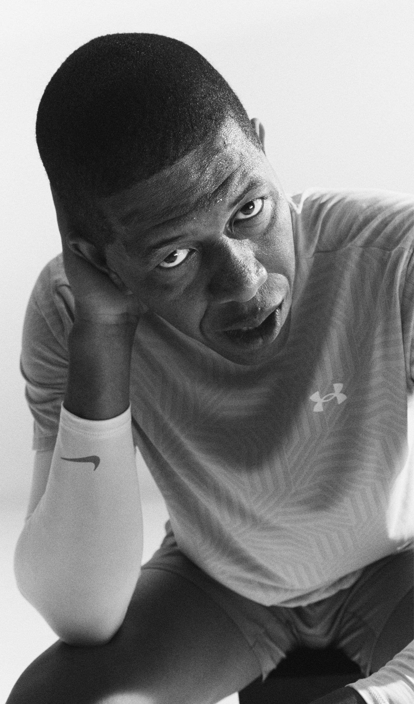
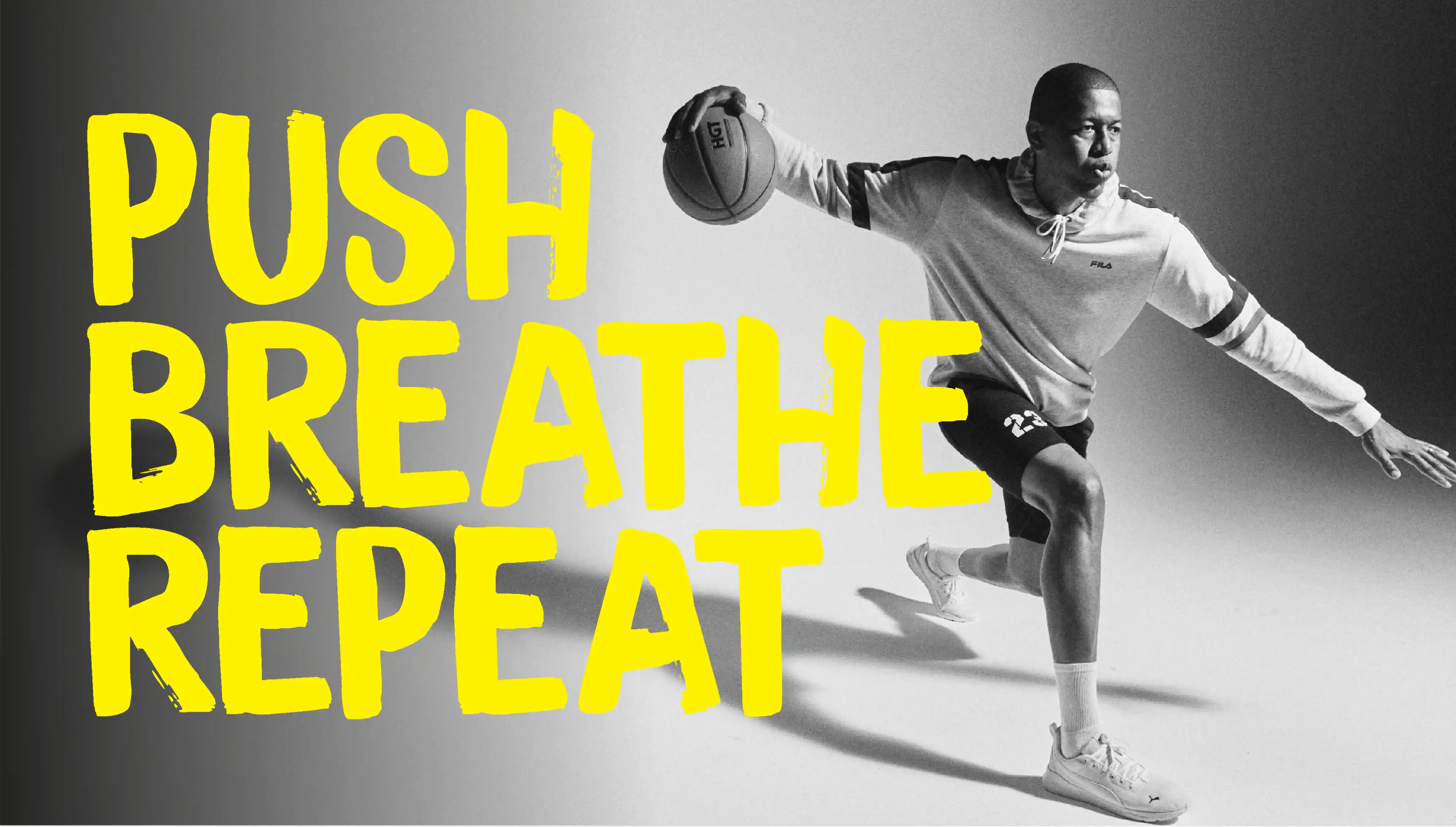
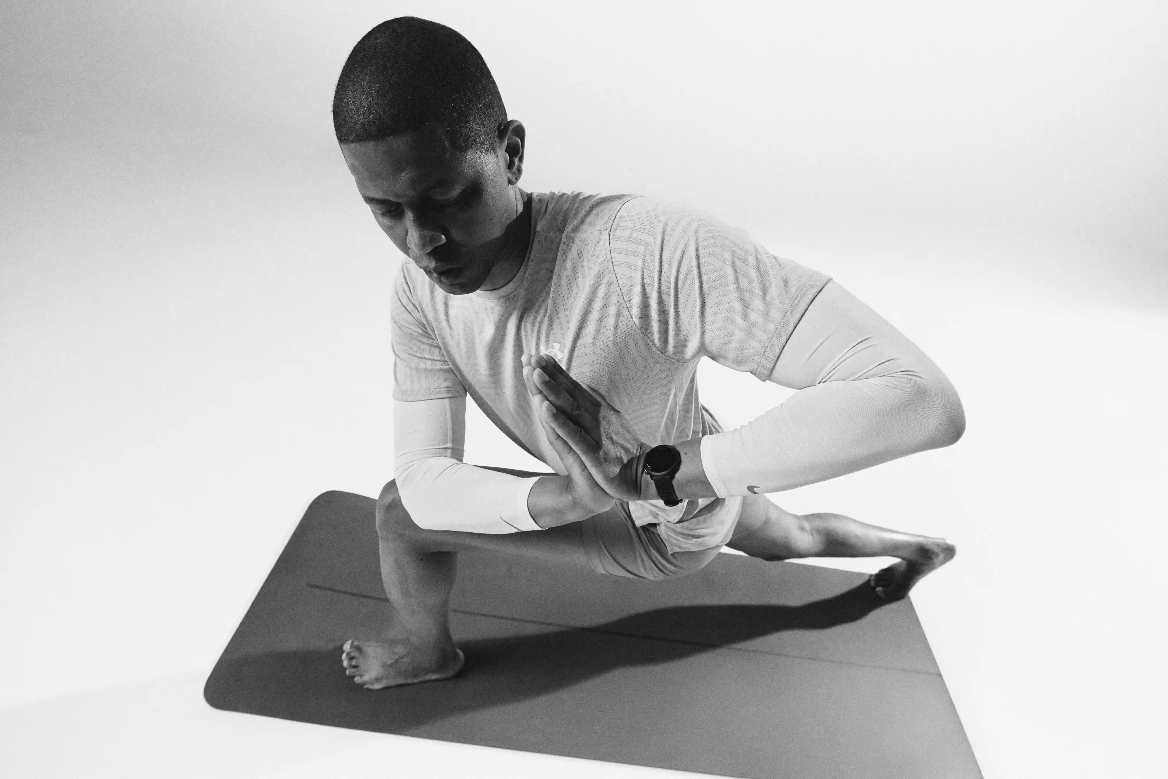
This is where Blink’s brand design really drives the concept. We built an identity system that borrows from protest culture and street sport — more rally than campaign. Bold uppercase typography. High-contrast black-and-white imagery. Slogans that look hand-applied with tape. Messaging that feels urgent, not polite. Instead of corporate retail comms (“Sale – Up to 40% Off”), the tone is physical, direct, energetic. It sounds like sport. It sounds like movement. It sounds temporary. That voice is now part of Stadium Outlet’s competitive edge. It signals: We are fast. We are real. We are here to move product — and we’re not shy about it.

Discover how

Cross Icon

Here’s how Blink applied our consumer-centric, commercially focused retail design approach when developing Stadium Outlet:

1. Insight & Strategy

We analysed how value-driven sports shoppers actually behave: they move fast, they hunt, they want proof that the product is real and the deal is real. From that we defined Stadium Outlet’s position as “quality access at speed” — not bargain bin, but insider opportunity. This strategic definition drove everything else, including tone of voice.

2. Concept Ideation

We named the creative platform “Celebrate the Outlet — Retail Rebels.” No pretending. No cosmetics. The warehouse is the stage, and rebellion is the attitude. This is where the spatial concept and the brand concept lock together: industrial materials, exposed structure, visible logistics flow — all elevated into identity.

3. Design & Prototyping

We translated the idea into a physical and visual toolkit:

  • Container modules as hero stages for product drops.
  • Pallet racking used not just for storage, but as a framing device that shapes sightlines and creates impact walls.
  • Navigation and messaging applied in a way that feels fast, taped-up, immediate — like a takeover, not like corporate signage.

We also developed the graphic voice: raw sports photography, blown-up typography, manifesto-like copy. Every poster reads like a rallying cry.

4. Execution & Implementation

Blink built a full implementation playbook covering both store build and brand expression — ensuring that Stadium Outlet can brief local partners in new markets without losing the soul of the concept — the containers, the tone, the edge.

5. Evaluation & Optimisation

Stadium Outlet trades in limited batches, so the store had to behave like a live channel. We didn’t design a frozen flagship. We designed a platform that can keep moving.

“This is our biggest commerial success and the most profitable part of the Stadium Group.”

— Carl Eklöf, CEO, Stadium Group

Want to know more about this project?
Contact Richard Kylberg, founder of Blink

Want to know more?
Contact Richard Kylberg, founder of Blink

Copy Text to Clipboard
richard@blinkthedesignagency.com

LINK COPIED!

Copy Text to Clipboard
+46 73 545 50 18

LINK COPIED!

LINKEDIN

Related cases