

Vivantis landed in our studio with unusual clarity. This Czech beauty, health and lifestyle retailer had built a thriving online business, but they needed to translate digital adrenaline into bricks and mortar, fast. The brand had energy, community, and commercial momentum online — but zero physical presence. They wanted their first flagship in Prague to feel like stepping inside a dopamine hit. Not another sterile beauty hall. Not another minimalist Scandi box. Something that made people feel something. As a retail design agency in Sweden with deep experience in European markets, we knew exactly how to bring their digital energy into physical space.
Most beauty retailers face a predictable set of obstacles — commoditized product assortments, showrooming, price transparency, and the slow death of foot traffic. Vivantis faced something else entirely: how do you take a brand that lives in thumbs-scrolling-through-flash-sales and turn it into a destination people choose to visit? How do you compete with the sofa, the algorithm, and two-day delivery? The challenge wasn't just spatial. It was emotional, behavioral, and cultural. We needed to design an environment that justified the journey, rewarded curiosity, triggered sharing, and — critically — moved product at the velocity Vivantis was famous for online.
Our research phase combined customer journey mapping, competitive store audits across European beauty retail, and deep dives into what actually makes people leave their homes. As Scandinavian retail design experts, we studied fairground psychology, treasure-hunt retail formats, and the dopamine design principles behind successful pop-up experiences.
Younger shoppers don't want frictionless transactions in beauty — they want to stumble into things. Serendipity drives basket size.
If it's not worth filming, it's not worth the commute. Instagrammability isn't vanity — it's functional marketing infrastructure.
Flash sale energy isn't just about price — it's about urgency, scarcity, and the emotional high of "getting it before it's gone." That needed a stage.
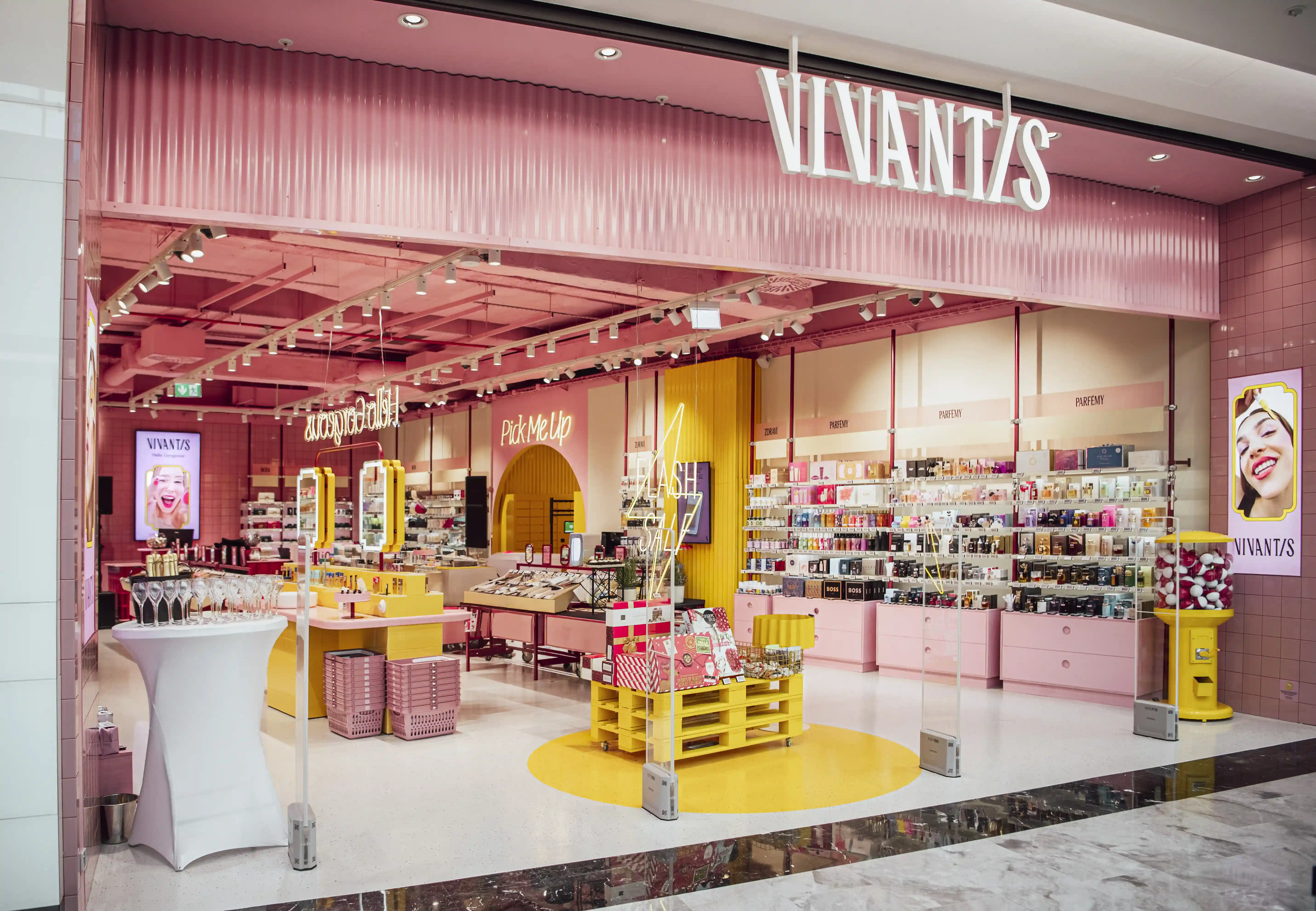
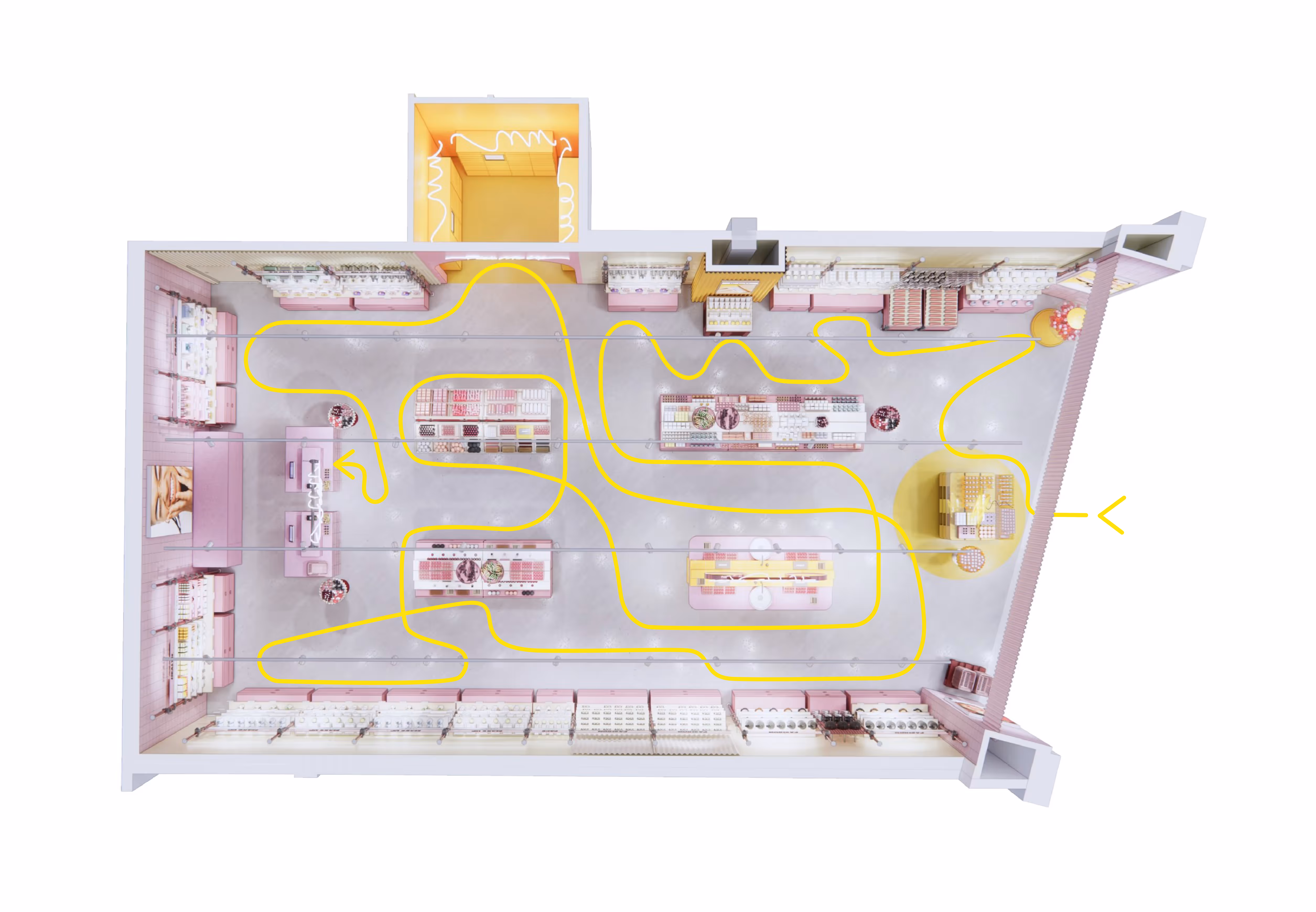
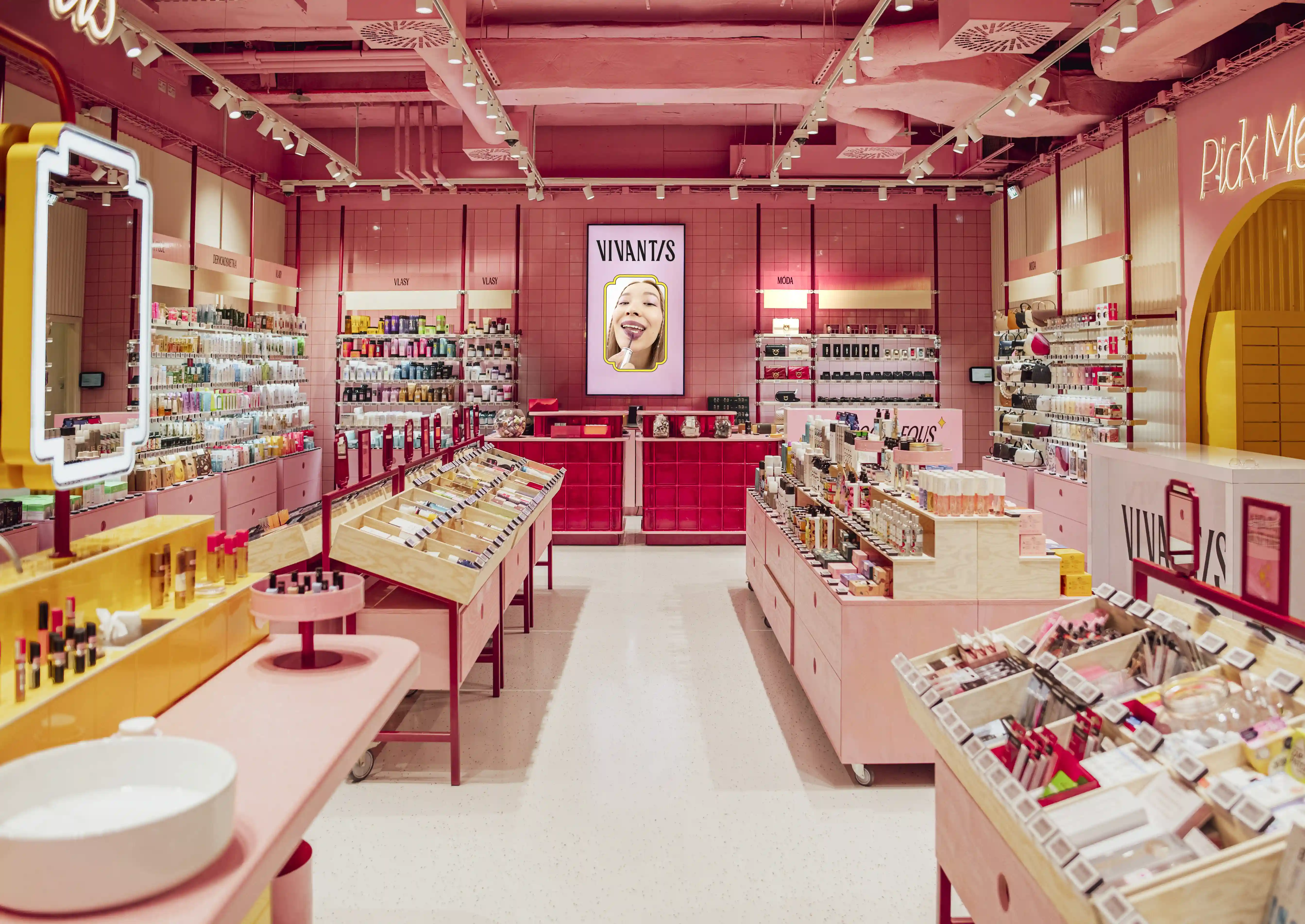
We designed what we called Beauty Candy Land — a retail concept design that borrows from confectionery stores, pop art, market halls, and that specific joy you feel walking into a well-designed chaos. The strategy was simple: every square meter needed to spark curiosity, invite touch, or trigger a smile. We wanted customers to wander, not navigate.This wasn't about throwing color at walls. It was about architecting delight into the customer flow, making each zone feel like a distinct micro-experience, and ensuring commercial rigor sat underneath every playful gesture. Our approach as store interior design specialists meant balancing theatrical moments with operational efficiency.

We turned Vivantis' digital flash sale heartbeat into a physical thunderclap. A monochrome yellow room — unapologetically loud — filled with wheeled industrial pallets, wire dump bins, and animated LED messaging that pulses with the same "act now" energy that drives their app. This zone deliberately disrupts. It's designed to make you stop, scan, grab, and feel like you've won something. The flexible fixtures allow lightning-fast merchandising swaps, keeping the offer fresh and the energy kinetic. This isn't just a promotional corner — it's the store's commercial engine, proving that online retail energy can absolutely translate into physical space.
Pink subway tiles. Halo lighting. Open, inviting, utterly filmable. This isn't a tester station — it's a gathering point. We designed the Beauty Bar as the store's emotional nucleus, where groups arrive, influencers film, friends compare shades, and strangers start conversations. The layout encourages lingering, the lighting makes everyone look good, and the surrounding product becomes part of the content. It's retail design meeting social infrastructure, and it's where Vivantis builds community in real time.
Greeting customers at entry, this fixture does exactly what its name promises: it looks like an oversized candy dispenser, filled with beauty products instead of gumballs. Pure theatre. It sets the tone immediately — you're not in a serious place, you're somewhere that plays. It's a photographic anchor, a conversation starter, and a merchandising hero all at once.
We created mobile, market-style display tables that rotate weekly, sometimes daily. Inspired by European food halls and vintage candy counters, these wheeled units allow the team to remix the floor constantly. Integrated storage keeps operations smooth while corrugated textures and bold accents keep them visually punchy. They turn the sales floor into a living, breathing organism rather than a static grid.
Hidden deeper in the store, this immersive yellow chamber houses 150 automated lockers for online order pickup. But it doesn't feel like a logistics area — it feels like stepping inside a highlighter pen, in the best way. We added a private zone for sensitive product categories, making the omnichannel experience discreet, efficient, and surprisingly delightful. Even the mundane stuff gets the Candy Land treatment.
Floor-to-ceiling pipe shelving, hydraulically tensioned, infinitely adjustable. We mixed corrugated metal panels, bold category graphics, and smart hidden storage to create a modular system that gives Vivantis its visual rhythm. It's functional architecture that doubles as brand identity — instantly recognizable, endlessly flexible, and ready to scale across future locations.
Execution demanded precision behind the playfulness. Working as a European retail design studio, we coordinated with local Czech fabricators, balancing custom storytelling elements with cost-efficient modular systems. The Flash Sale Zone's industrial fixtures needed to handle constant rotation without falling apart. The Beauty Bar's tile work and lighting required millimeter-level accuracy to achieve that flawless glow. Material choices balanced durability with texture — glossy where we wanted energy, matte where we needed warmth.
The timeline was aggressive. Concept to opening in under eight months, coordinating across Swedish design direction and Czech build partners. We solved dozens of small problems — acoustics in the yellow rooms, flexible power for moving tables, ensuring the candy machine could be restocked without disrupting flow.

They exceeded first-month sales targets significantly. Customer dwell time tripled compared to category benchmarks. The Beauty Bar became exactly what we designed it to be — a magnet for groups, content creators, and repeat visits. Social media mentions exploded, driven by customers filming and sharing organically.
The concept is now rolling out to additional locations, proving that joy, color, and strategic chaos aren't just aesthetic indulgences — they're legitimate retail drivers in a market that desperately needs new reasons to visit physical stores. Our retail concept design in the Nordics and across Europe continues to demonstrate that experiential retail isn't just viable — it's essential.
richard@blinkthedesignagency.com
+46 73 545 5018
Blink is a leading retail design agency based in Sweden, specializing in retail concept development, store experience design, and omnichannel integration across the Nordics and Europe. We transform brands into physical destinations that drive both emotional connection and commercial performance.
.jpg)
