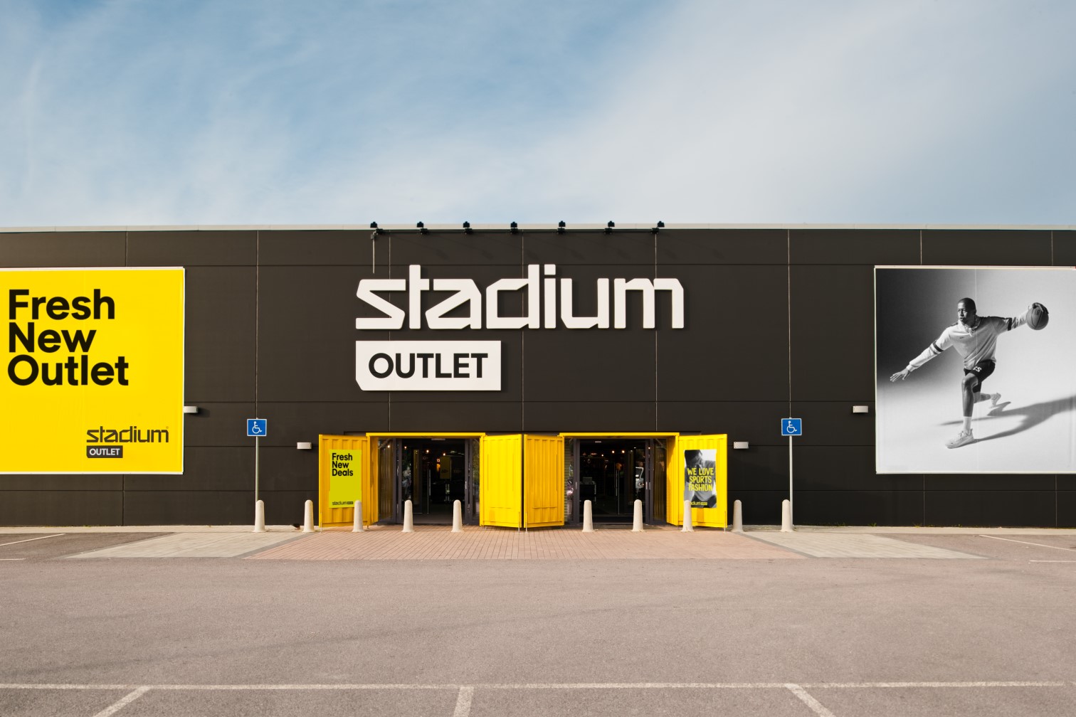
Albert Heijn is not just a supermarket; it is a household institution in the Netherlands. When you think of Dutch grocery retail, you think of "Appie". However, even giants face the shifting tides of consumer behavior.
As the demand for online grocery shopping skyrocketed, they approached Blink—a premier retail design agency in Sweden—because they realized their physical infrastructure wasn’t keeping pace with their digital promises. They didn't just need a renovation; they needed a translation of their digital efficiency into a brick-and-mortar reality. They sought out our Scandinavian retail design experts to create a dedicated Pick-Up Point concept that could handle high volumes without losing the brand's warmth.


The core issue was a classic case of growing pains. Albert Heijn’s existing click-and-collect process was suffering from success. The primary challenge was "friction." Customers loved the app, but the physical act of retrieving groceries was often chaotic, involving confusing navigation, awkward waiting times, and a lack of spatial logic.
As store interior design specialists, we identified that the problem wasn't the product; it was the handover. The retailer faced declining customer satisfaction scores related to wait times and traffic flow.
Staff were stressed, running interference between confused drivers and a back-of-house storage system that wasn't optimized for rapid retrieval. The challenge was to transform a purely functional transaction into a seamless, branded service experience that felt as easy as clicking "buy."
Before drawing a single floor plan, Blink, acting as a thorough European retail design studio, went into the field. We don't guess; we observe. Our "Discover How" phase involved deep-dive consumer research, utilizing everything from surveys to behavioral shadowing. We needed to understand the emotional state of a customer who is likely in a rush.

We discovered a massive pain point immediately upon arrival. Customers often felt a spike of anxiety entering the lot, unsure of which lane to enter or where to park for service versus standard shopping. This hesitation slowed down the entire flow before the car even stopped.
Our research highlighted that waiting feels twice as long when you don't know what's happening. Customers waiting for their groceries felt disconnected from the process, leading to perceived long wait times. The lack of visibility into the "picking" process created a psychological barrier.
By conducting empathetic interviews with staff, we realized the internal layout was forcing employees to cross paths with customers and each other inefficiently. The "last ten meters" of the product journey were the most expensive in terms of time.
Our strategy was rooted in the philosophy that defines us as retail concept design in the Nordics: functional minimalism. We approached this not just as a store design, but as a mobility hub. We looked at pit stops and drive-thrus rather than traditional grocery aisles. The strategy involved a radical simplification of the user journey.
We decided to co-create the solution with the stakeholders. Instead of designing for them, we designed with them. The core strategic pillar was "Transparency and Flow". We wanted to remove every unnecessary decision the customer had to make. If a customer has to think about where to walk or drive, we have failed. We aimed to utilize our background as Scandinavian retail design experts to bring a sense of calm order to a chaotic logistical process.
.webp)

We re-engineered the lot and interior layout to function like a well-oiled machine. We implemented a unidirectional flow system. You enter, you are guided to a bay, and you exit. No reversing, no crossing streams. It’s the kind of logic we love as store interior design specialists.
We overhauled the wayfinding entirely. Using bold, intuitive iconography and color-coding, we ensured that navigation was subconscious. The signage isn't just decoration; it’s an instruction manual for the space that can be read at 20 km/h.
To counter the cold, industrial feel typical of warehouses, we injected the space with warmth. We utilized sustainable woods and soft, yet high-visibility LED lighting. The lighting serves a dual purpose: it creates a welcoming ambiance for the customer and provides high-lumen clarity for staff checking orders, reducing errors.
We integrated digital touchpoints that communicate with the customer’s app. When they arrive, screens acknowledge their presence. It’s a personalized "Hello" that bridges the digital-physical divide.
True to our reputation as a European retail design studio focused on the future, we maximized eco-friendly materials. From recycled flooring materials to energy-efficient climate control in the holding areas, the design supports Albert Heijn’s sustainability commitments.
Implementation is where good ideas often die, but not with Blink. We employed a rigorous prototyping and testing phase. Before the final rollout, we built mock-ups of the pick-up lanes to test turning radii and trunk-loading ergonomics.
One of the main challenges we faced during execution was retrofitting this new high-speed concept into existing, older real estate. It required surgical precision to carve out the necessary square footage for the back-end retrieval system without cannibalizing the main store’s sales floor.
However, through continuous optimization and monitoring of performance metrics during the soft launch, we tweaked the lane widths and digital kiosk placements to ensure the "Pit Stop" effect was achieved. It was a testament to why we are considered the go-to retail concept design in the Nordics.
Average customer pick-up time dropped significantly. The improved traffic flow allowed the store to process a higher volume of orders per hour without adding staff. There was a measurable increase in online order frequency, as the "hassle" of pickup was removed.
Customer satisfaction scores regarding the "ease of pickup" skyrocketed. Staff reported lower stress levels and fewer traffic conflicts in the loading zones. Albert Heijn has solidified its position as a leader in retail convenience.
richard@blinkthedesignagency.com
+46 73 545 5018
Blink is a leading retail design agency based in Sweden, specializing in retail concept development, store experience design, and omnichannel integration across the Nordics and Europe. We transform brands into physical destinations that drive both emotional connection and commercial performance.
.avif)
.webp)