Modern pink-themed beauty and cosmetics store interior with shelves and displays filled with products.

Vivantis approached us with a bold ambition. Create a physical retail destination that captures the joy, energy, playfulness, and discovery of their online world. Our response was Beauty Candy Land.

  • CLIENT

    Vivantis

  • LOCATION

    Czech Republic

  • INDUSTRY

    Beauty, health & Lifestyle

  • SCOPE

    Retail concept, store design, customer experience, in-store, communication, brand expression

Brightly lit cosmetics store with yellow and pink counters, two illuminated vertical mirrors, and display shelves filled with makeup products.
Black stylized text reading 'VIVANT/S' on a solid pink background.
Top-down view of a brightly lit retail store interior with pink-themed displays and a yellow path marked with numbered circles from 1 to 8.

Opportunity and concept

Cross Icon

A retail universe where the rules soften, the colors grow wilder, and delight takes centre stage. A beauty environment where shoppers wander, smile, touch, explore, share and stumble into small moments of surprise. We drew inspiration from candy shops, pop culture, fairground aesthetics and treasure-hunt retailing to create a store that feels alive, indulgent and emotionally warm.

Beauty Candy Land is a flash-sale energy exploding into the physical world. Bold colors bursting with personality, playful materials and glossy textures with product displays that feel like little treats. In an environment that invites customers to stay — and return.

It’s not just beauty. It’s beauty + pleasure + value + community, made physical.

Result and impact

Cross Icon

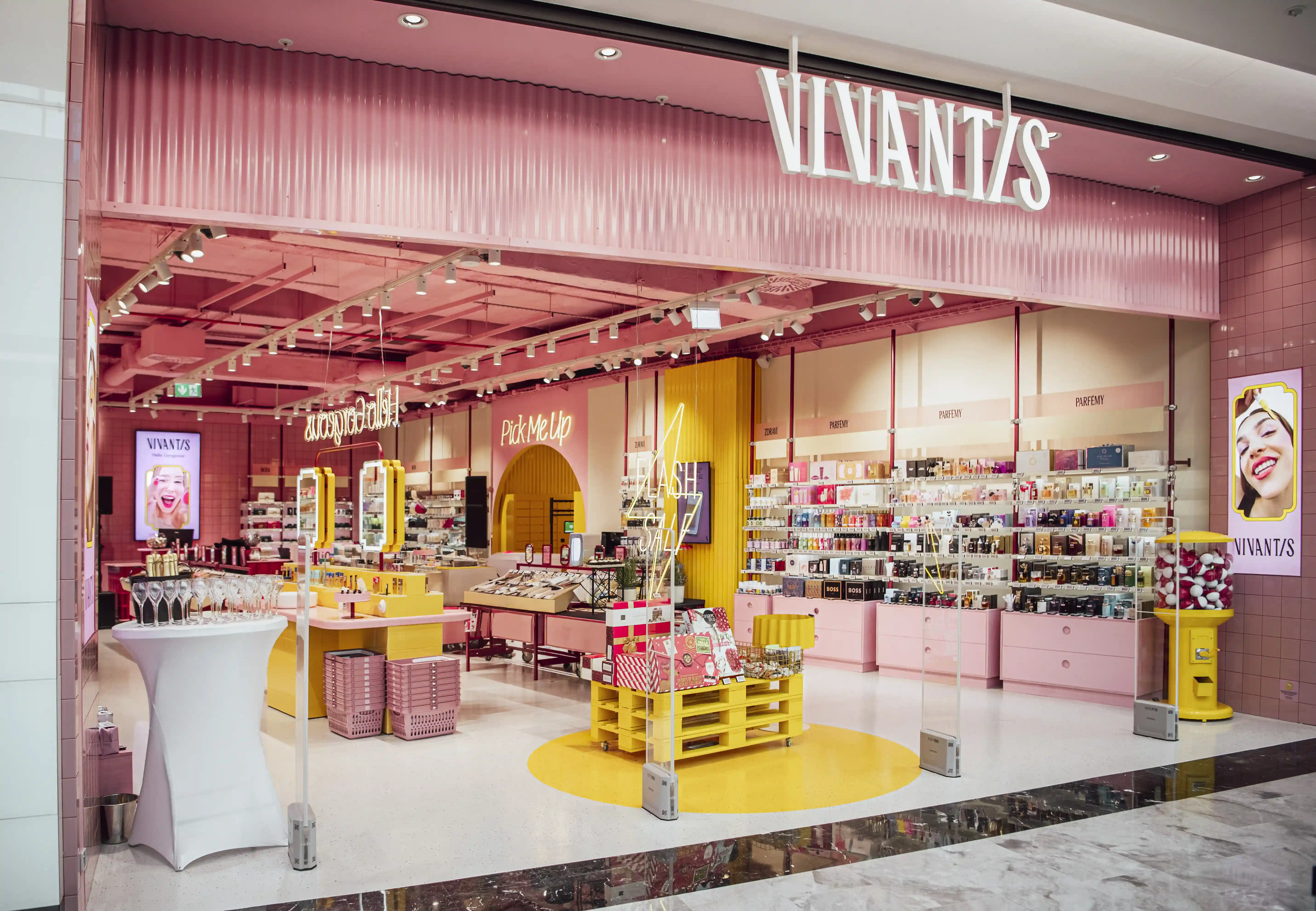
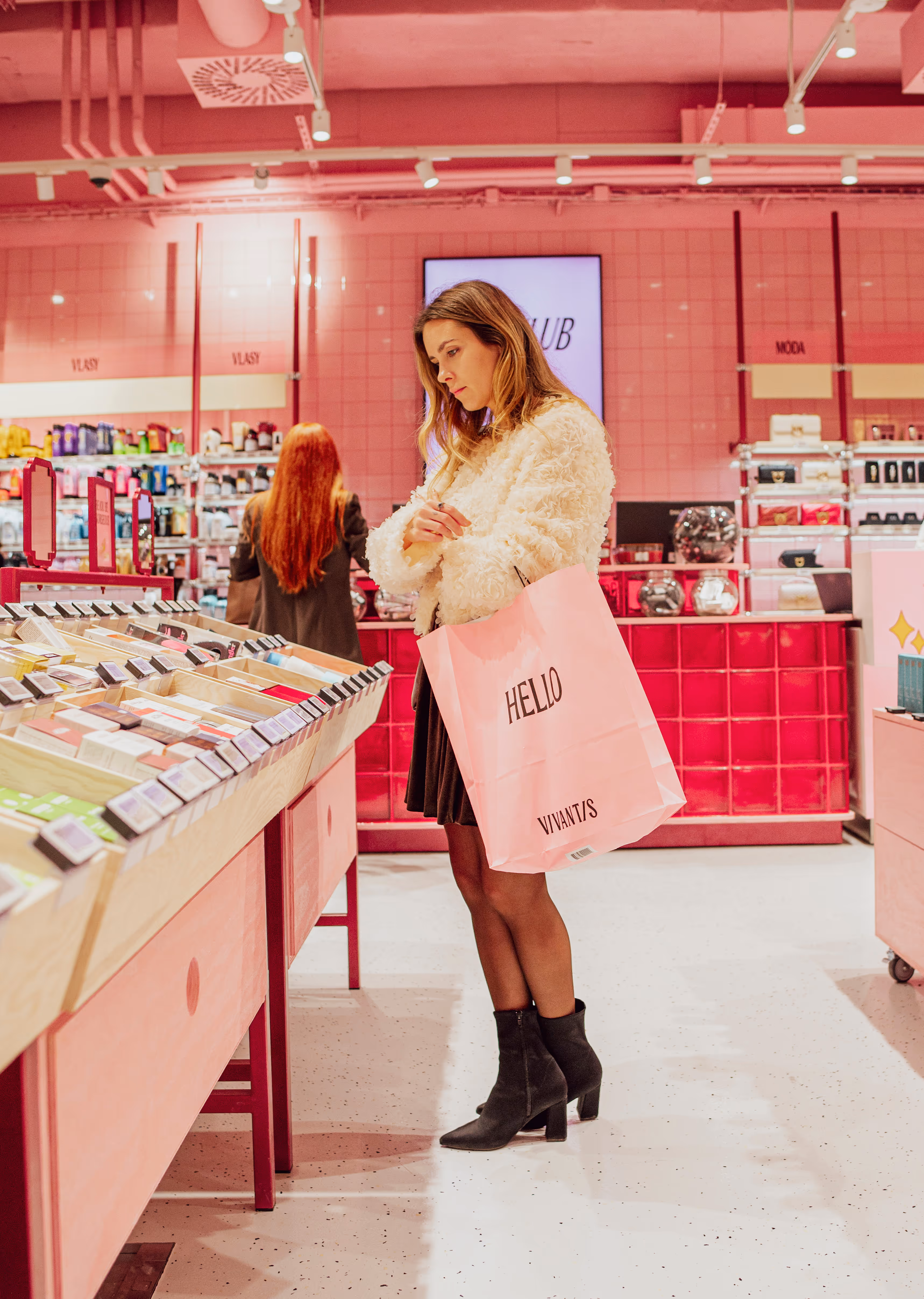
Vivantis Beauty Candy Land redefined what a beauty store can feel like. This is not a store customers simply “pass through.” It is a place they step into and stay in because it is joyful, immersive, and constantly surprising.

Key impact

  • Vivantis gained a uniquely ownable retail identity, impossible to confuse with any competitor. The Flash Sale Zone injected the brand’s digital energy vividly into the physical world.
  • The modular building blocks made the concept tight, cost-efficient and rollout-ready for any footprint.
  • The Beauty Bar became a true community hub, attracting influencers, groups and social interaction.
  • The Pick-Up Room delivered a new kind of omnichannel destination — practical, bold and unmistakably on-brand
  • Most importantly: the concept has been a commercial success far beyond the client’s expectations, proving that joy, color and surprise are not just aesthetic choices, but powerful retail drivers.

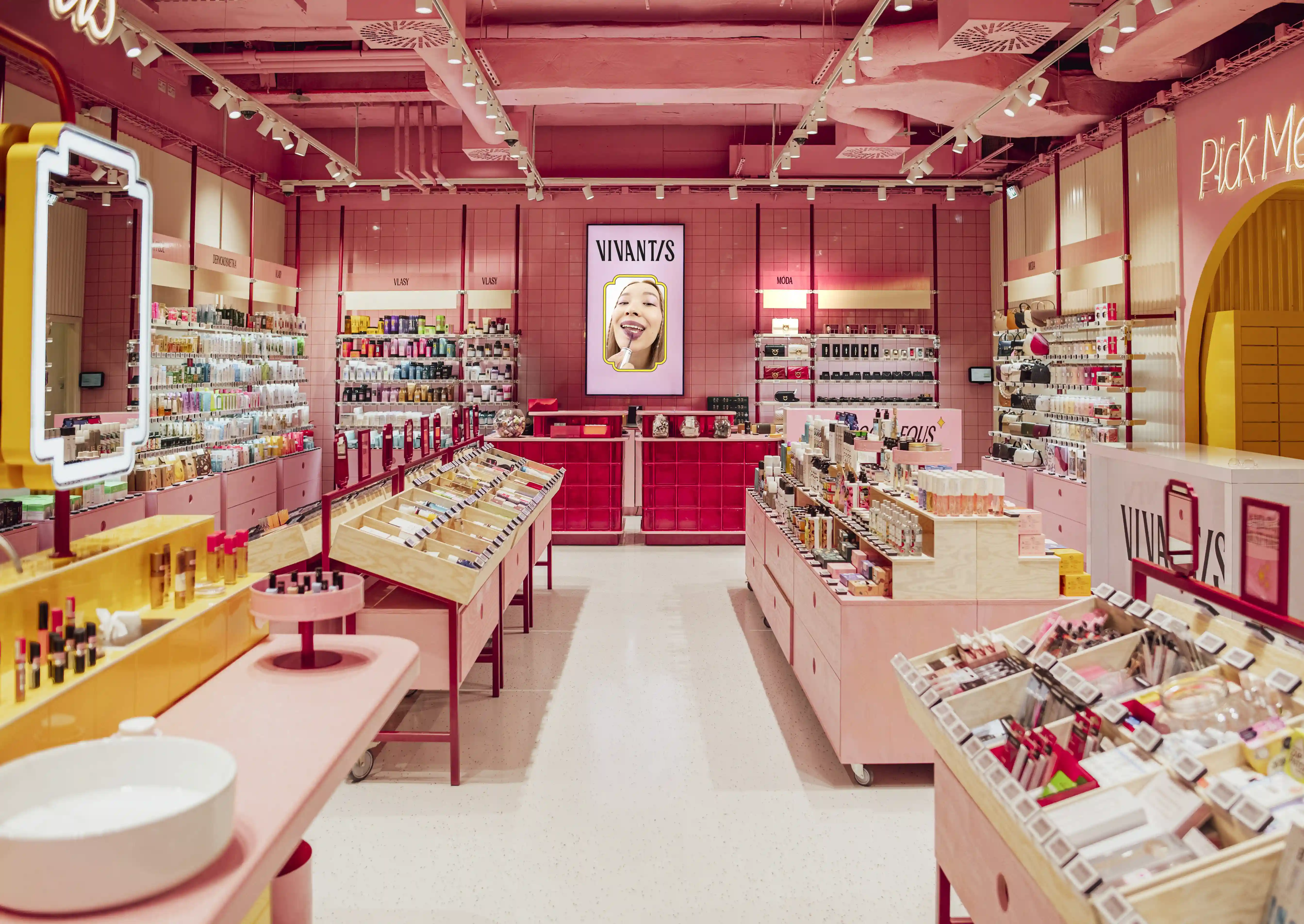
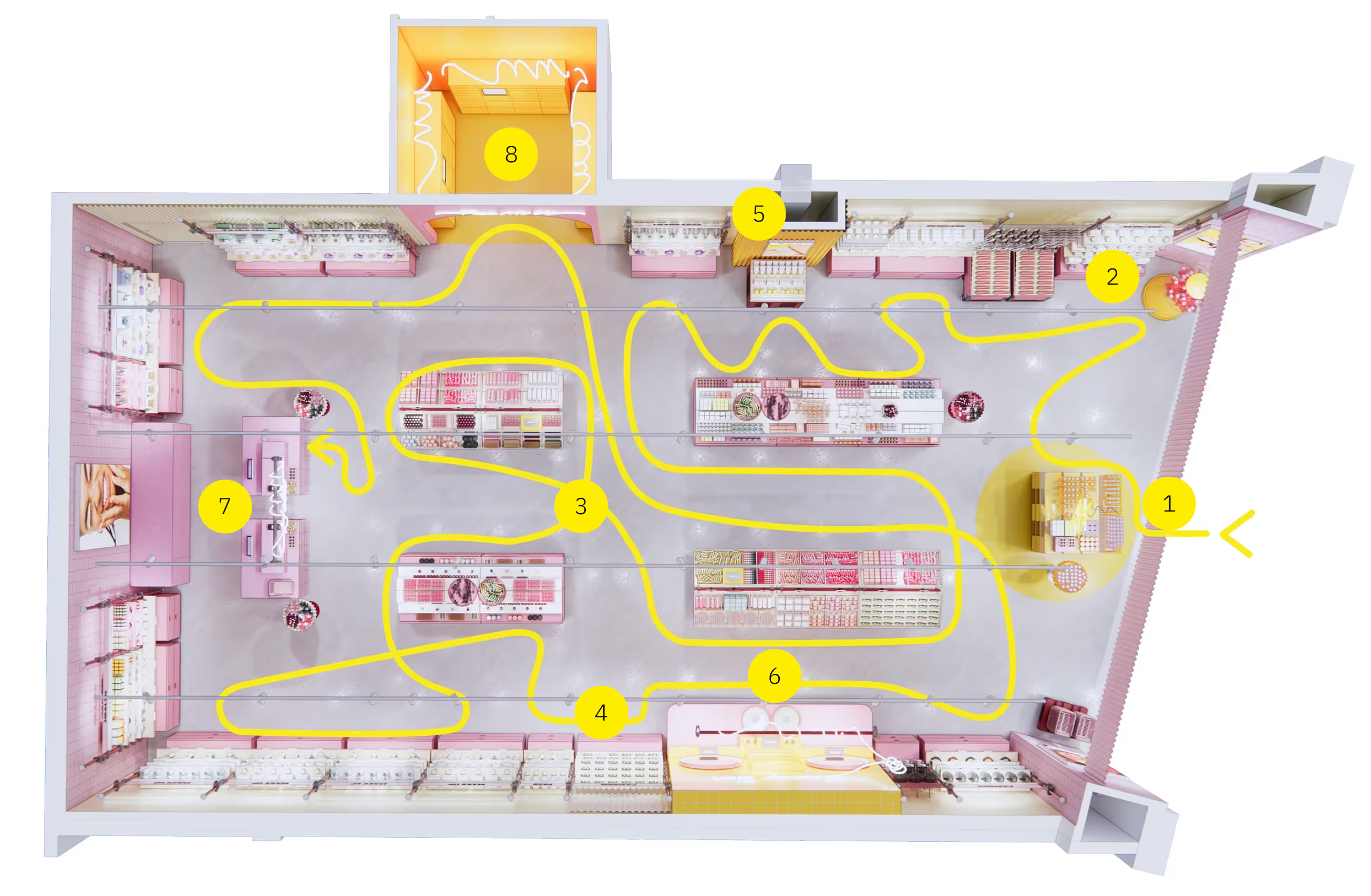
Each zone of the store is crafted to delight and engage customers. Together, they create a seamless journey full of color, energy, and unexpected discoveries.

1. Flash Sale Zone

The physical embodiment of Vivantis’ online heartbeat, where omnichannel flash sales burst into real life. If it’s gone, it’s gone. And customers know it. This is the commercial engine of the store and the clearest link to the brand’s digital DNA — fast, energetic, and unapologetically value-driven. A monochrome yellow arena where urgency, excitement and opportunity collide. Wheeled pallets, crash-style wire baskets and animated LED signage create a high-velocity environment that pushes shoppers to act now, not later.
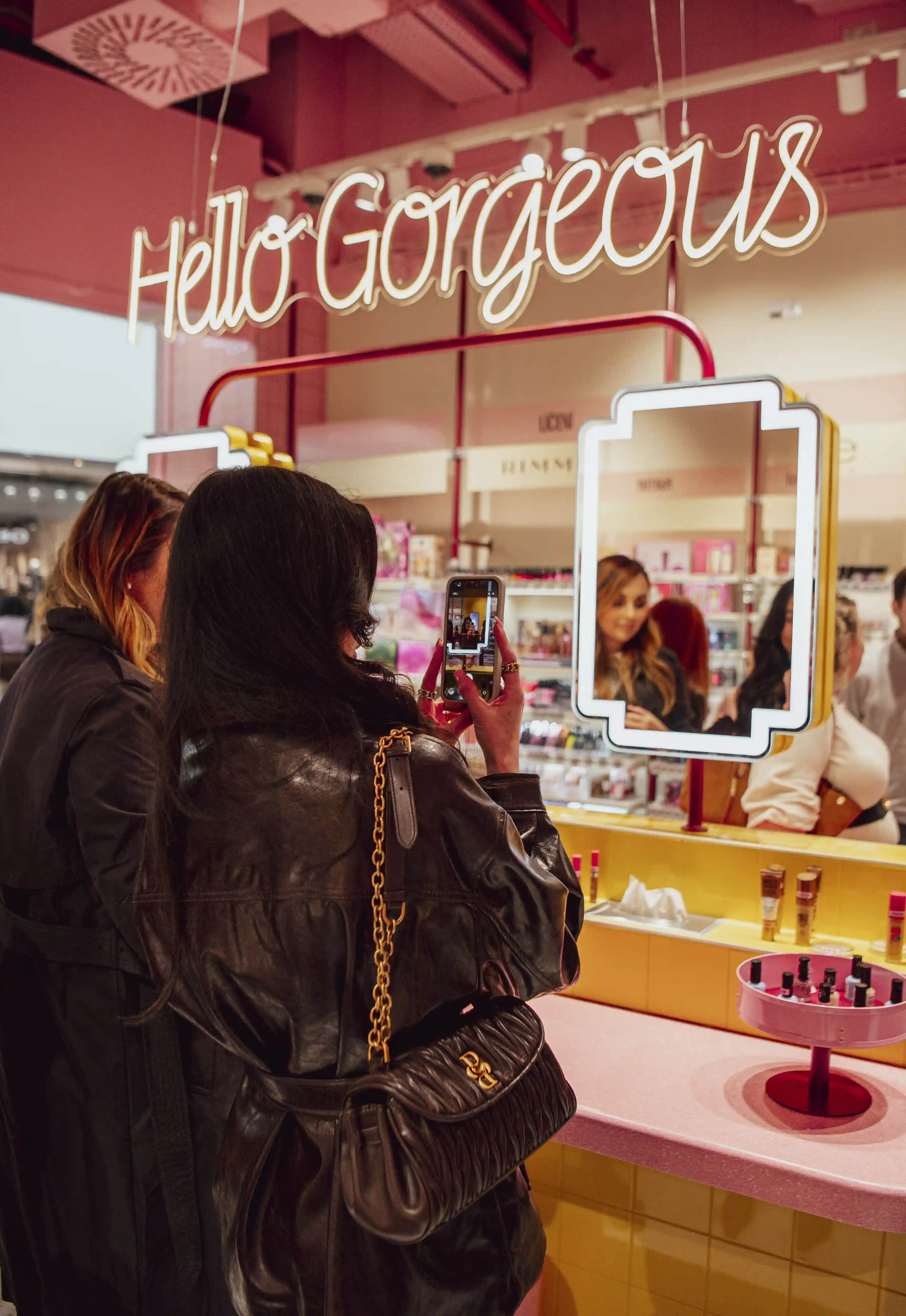
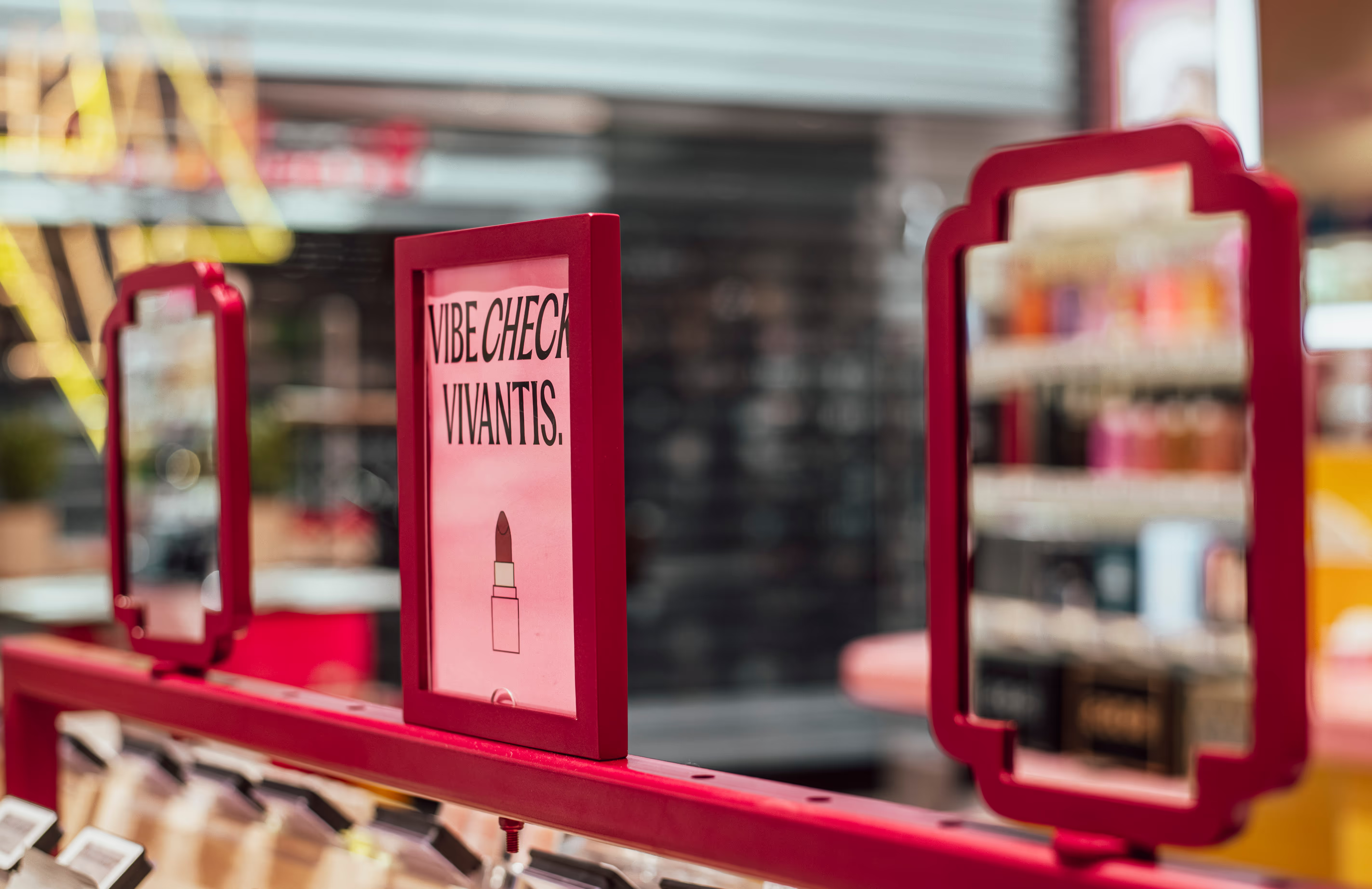
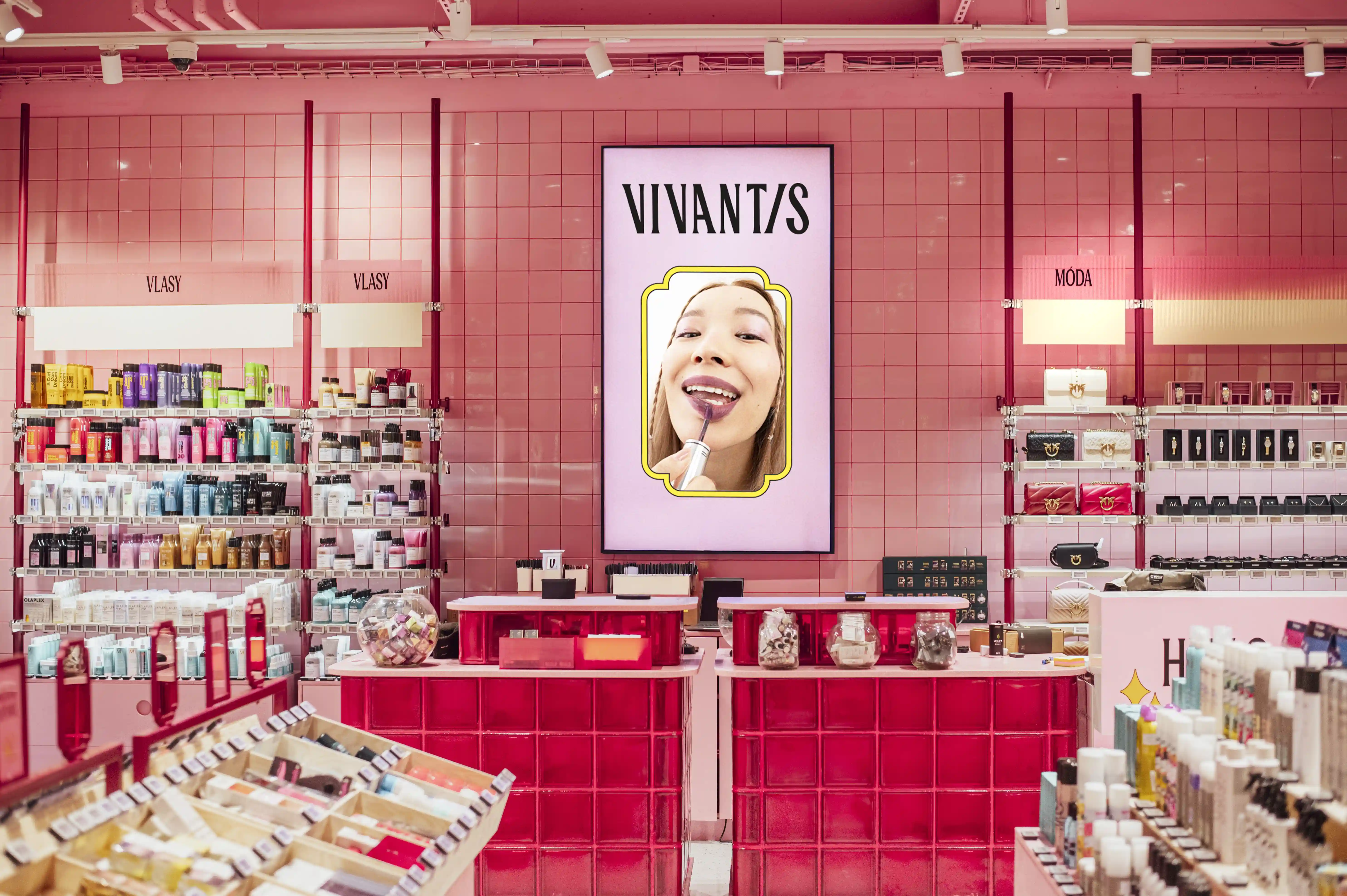
2. Beauty Bar

The emotional and social centre of the concept. A pink-tiled, halo-lit, irresistibly instagrammable hub where customers gather, test, compare, talk, photograph, share, laugh and play. Designed for groups, influencers, tutorials, product trials and spontaneous discovery. The Beauty Bar turns beauty shopping into a shared, joyful micro-event. Not just a fixture — a community magnet.

3. Beauty Candy Machine

The icon of Beauty Candy Land — playful, intriguing, impossible to ignore. It greets shoppers with a candy-inspired wink and instantly sets the tone as light-hearted, colorful and a little mischievous. It’s more than a display, it’s a promise that the store is filled with small delights waiting to be discovered.

4. Market Style Tables

Flexible, wheel-based merchandising units inspired by modern market stalls and candy-store theatre.
Engineered for fast rotation, seasonal storytelling and treasure-hunt browsing. Integrated storage makes them practical and their expressive design makes them unforgettable. A dynamic engine for constant excitement on the sales floor, always ready for the next drop.
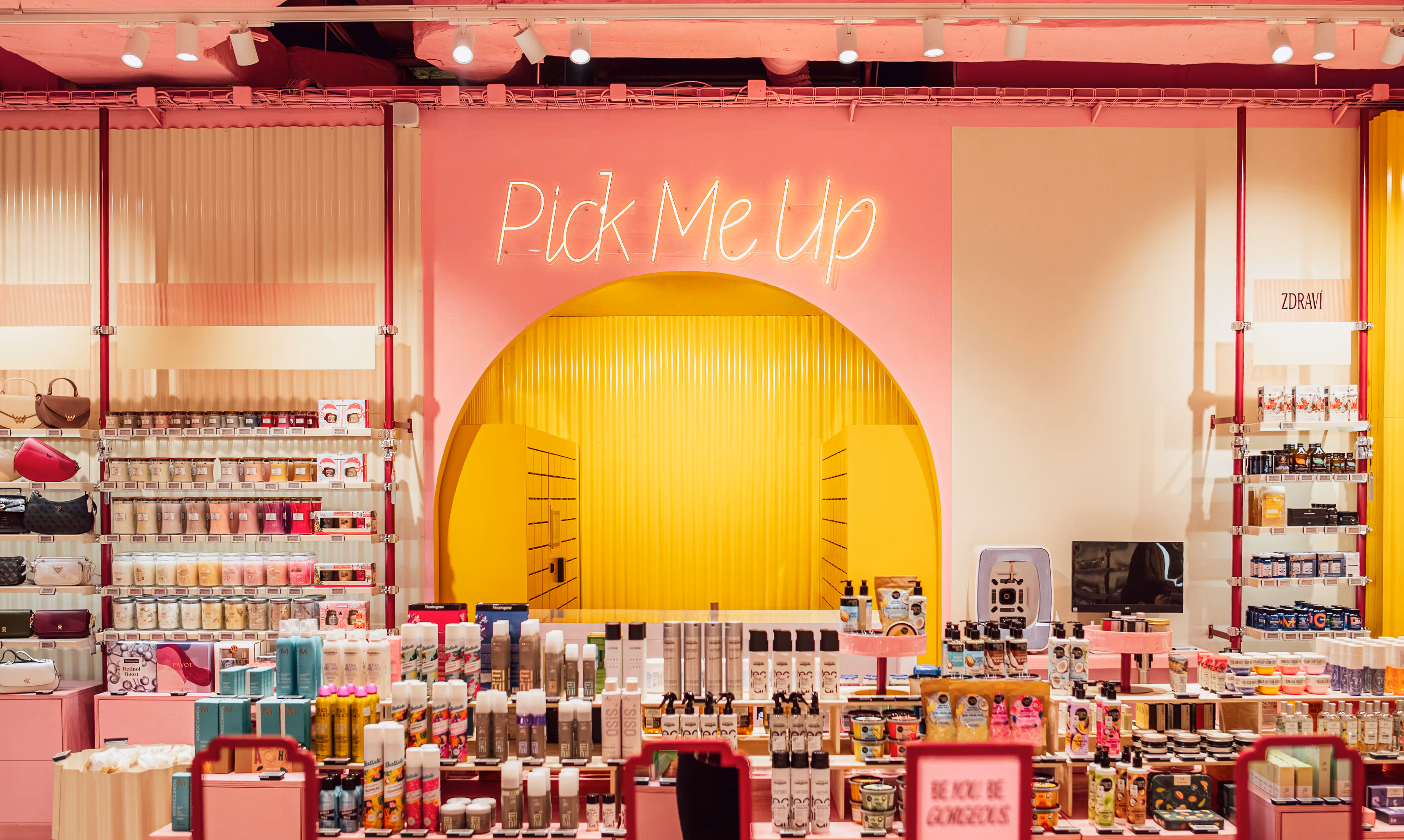
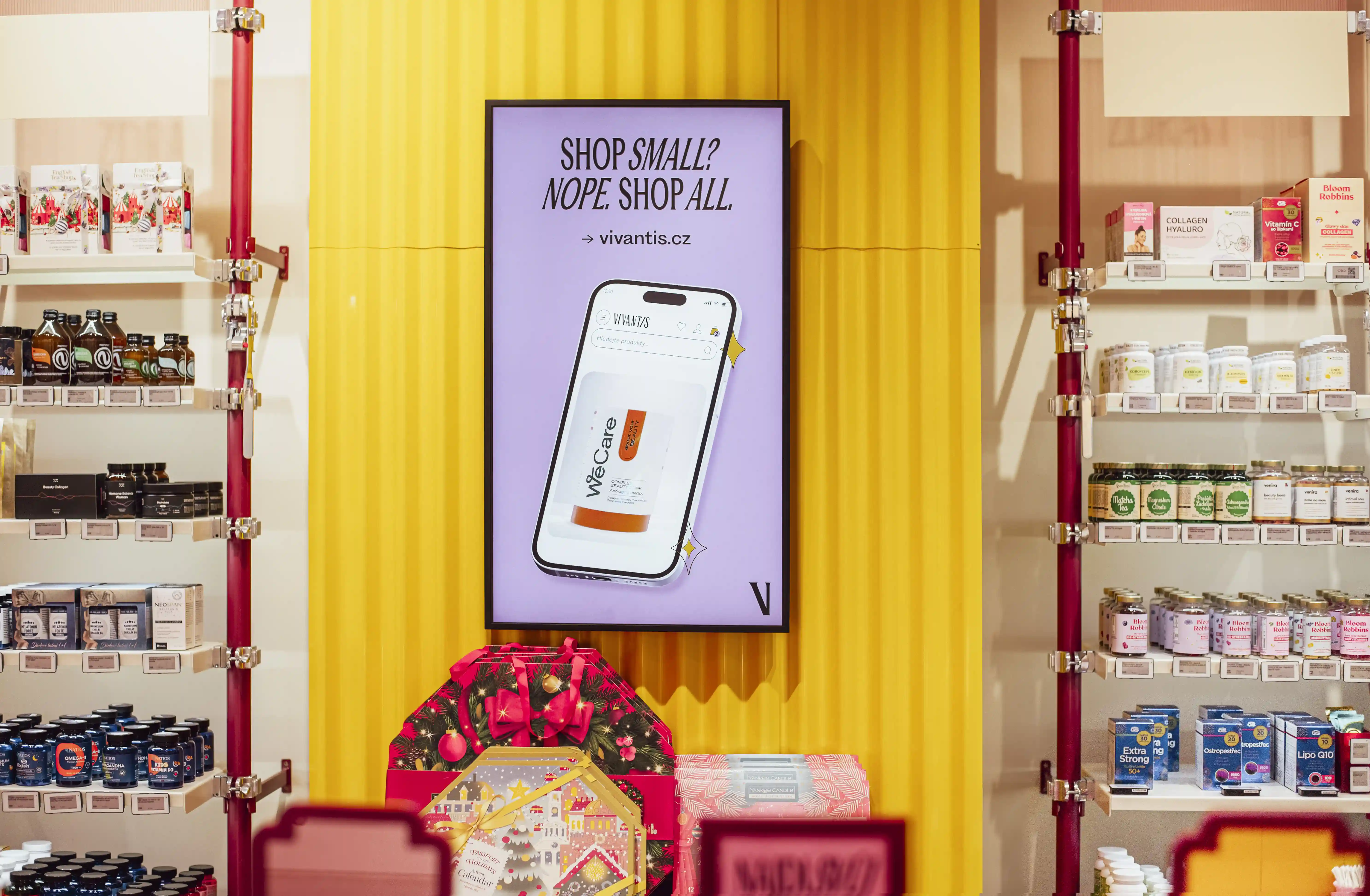
5. Pick-Up Room

A fully immersive yellow chamber — hidden, surprising and unmistakably on-brand.
One hundred and fifty pickup lockers, plus a discreet zone for intimate categories, transform online order collection into a memorable moment rather than a mundane task. Practical, bold, and designed with a wink.

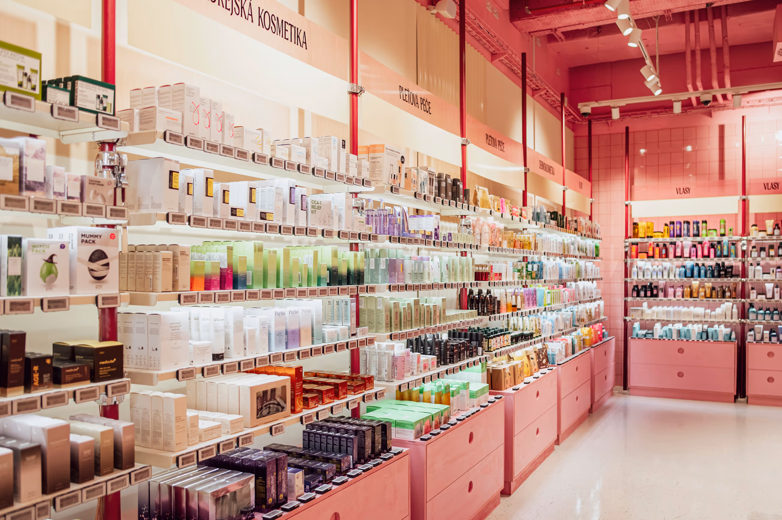
6. Wall Shelving System

A hydraulically tensioned, floor-to-ceiling pipe structure that gives Vivantis its distinctive vertical rhythm. Modular, adjustable and expressive. Mixing corrugated surfaces, bold category signage, smart storage and playful brand touchpoints. A functional workhorse that also acts as a signature design language.

Discover how

Cross Icon

Here’s how Blink applied our insight-driven, consumer-centric retail design approach to create a concept that became an instant commercial success.

1. Insight & Strategy

We analysed how beauty shoppers behave in both digital and physical value-driven environments. From this we defined a strategic platform built on discovery, delight and accessible indulgence.

2. Concept & Ideation

We shaped the creative platform Beauty Candy Land — translating strategy into a vivid, emotional, candy- colored world filled with opportunity, energy and playfulness.

3. Design & Prototyping

We developed a complete spatial and visual toolkit — the Flash Sale Zone, the Beauty Bar, the Candy Machine, modular market tables, wall systems and color/material palettes. All engineered for impact and flexibility.

4. Execution & Implementation

Blink produced full implementation guidelines, ensuring consistent rollout, efficient build-out and strong brand expression across formats and locations.

5. Evaluation & Optimisation

The concept is built for continuous movement. We designed a retail platform that supports rapid product rotation, live merchandising, seasonal storytelling and ongoing commercial refinement.

Brightly lit Vivantis retail store with pink and yellow decor, showcasing beauty and perfume products on shelves and display tables.

Client
Profile

Why Vivantis came to us

Vivantis landed in our studio with unusual clarity. This Czech beauty, health and lifestyle retailer had built a thriving online business, but they needed to translate digital adrenaline into bricks and mortar, fast. The brand had energy, community, and commercial momentum online — but zero physical presence. They wanted their first flagship in Prague to feel like stepping inside a dopamine hit. Not another sterile beauty hall. Not another minimalist Scandi box. Something that made people feel something. As a retail design agency in Sweden with deep experience in European markets, we knew exactly how to bring their digital energy into physical space.

Brightly lit retail store section with pink and yellow decor, featuring a 'Pick Me Up' neon sign above shelves stocked with beauty and wellness products.
Retail display with shelves of health supplements surrounding a digital sign on a yellow wall that reads 'SHOP SMALL? NOPE. SHOP ALL. vivantis.cz' with an image of a smartphone showing a WeCare product.

Challenge

Making Physical Retail Worth the Trip

Most beauty retailers face a predictable set of obstacles — commoditized product assortments, showrooming, price transparency, and the slow death of foot traffic. Vivantis faced something else entirely: how do you take a brand that lives in thumbs-scrolling-through-flash-sales and turn it into a destination people choose to visit? How do you compete with the sofa, the algorithm, and two-day delivery? The challenge wasn't just spatial. It was emotional, behavioral, and cultural. We needed to design an environment that justified the journey, rewarded curiosity, triggered sharing, and — critically — moved product at the velocity Vivantis was famous for online.

Yellow wooden pallet table with beauty product gift sets and an illuminated neon sign reading 'FLASH SALE' in a brightly lit pink and yellow retail store.
Woman in a white fluffy jacket and black skirt shopping and holding a pink Vivantis bag inside a brightly lit cosmetics store.
Two women at a makeup counter with a neon 'Hello Gorgeous' sign, one taking a photo with her phone.
Interior of a brightly lit cosmetics store with shelves filled with various skincare and haircare products organized by category.

Insights & Research

Joy as Commercial Driver

Our research phase combined customer journey mapping, competitive store audits across European beauty retail, and deep dives into what actually makes people leave their homes. As Scandinavian retail design experts, we studied fairground psychology, treasure-hunt retail formats, and the dopamine design principles behind successful pop-up experiences.

Three insights shaped everything

01

Discovery beats efficiency.

Younger shoppers don't want frictionless transactions in beauty — they want to stumble into things. Serendipity drives basket size.

02

Social experience justifies the trip.

If it's not worth filming, it's not worth the commute. Instagrammability isn't vanity — it's functional marketing infrastructure.

03

Value theatre works.

Flash sale energy isn't just about price — it's about urgency, scarcity, and the emotional high of "getting it before it's gone." That needed a stage.

Cosmetic display tables with skincare products and sample packets in a brightly lit store with pink and yellow decor.
Red-framed sign with text 'VIBE CHECK VIVANTIS.' and lipstick icon on a makeup display counter.

From Strategy to Execution

Cross Icon

Strategy

Architecting Delight Into Every Corner

We designed what we called Beauty Candy Land — a retail concept design that borrows from confectionery stores, pop art, market halls, and that specific joy you feel walking into a well-designed chaos. The strategy was simple: every square meter needed to spark curiosity, invite touch, or trigger a smile. We wanted customers to wander, not navigate.This wasn't about throwing color at walls. It was about architecting delight into the customer flow, making each zone feel like a distinct micro-experience, and ensuring commercial rigor sat underneath every playful gesture. Our approach as store interior design specialists meant balancing theatrical moments with operational efficiency.

Solution

Six Zones That Work Together

Vivantis brought its fast-paced online flash sales to life with the Flash Sale Arena, a bold yellow space designed to capture attention and drive immediate action. Industrial pallets, wire bins, and dynamic LED messaging create a high-energy environment where customers are encouraged to explore and engage. At the entrance, the Beauty Candy Machine adds a playful, approachable element, while the Beauty Bar provides a visually appealing and social space for customers to test products, compare shades, and interact — making the store both a retail and community hub.

The store’s design prioritizes adaptability and efficiency. Mobile market-style tables allow for frequent product rotation and floor updates, keeping the space dynamic and visually engaging. The Pick-Me-Up Room offers a streamlined, immersive experience for online order pickup, including a private area for sensitive items. Vertical Candy Stripes shelving provides modular, adjustable storage that supports operational needs while reinforcing brand identity. Together, these elements create a scalable, organized retail environment that combines visual impact with practical functionality.

Execution

Building Delight at Speed

Execution demanded precision behind the playfulness. Working as a European retail design studio, we coordinated with local Czech fabricators, balancing custom storytelling elements with cost-efficient modular systems. The Flash Sale Zone's industrial fixtures needed to handle constant rotation without falling apart. The Beauty Bar's tile work and lighting required millimeter-level accuracy to achieve that flawless glow. Material choices balanced durability with texture — glossy where we wanted energy, matte where we needed warmth.

The timeline was aggressive. Concept to opening in under eight months, coordinating across Swedish design direction and Czech build partners. We solved dozens of small problems — acoustics in the yellow rooms, flexible power for moving tables, ensuring the candy machine could be restocked without disrupting flow.

Bright pink-themed beauty store interior with shelves of cosmetics, a central counter, and a digital screen showing a woman applying lipstick.

Results

A Commercial Success Beyond Projections

Vivantis opened November 7, 2025

They exceeded first-month sales targets significantly. Customer dwell time tripled compared to category benchmarks. The Beauty Bar became exactly what we designed it to be — a magnet for groups, content creators, and repeat visits. Social media mentions exploded, driven by customers filming and sharing organically.

The real validation?

The concept is now rolling out to additional locations, proving that joy, color, and strategic chaos aren't just aesthetic indulgences — they're legitimate retail drivers in a market that desperately needs new reasons to visit physical stores. Our retail concept design in the Nordics and across Europe continues to demonstrate that experiential retail isn't just viable — it's essential.

Want to know more?
Contact Richard Kylberg, founder of Blink

Copy Text to Clipboard
richard@blinkthedesignagency.com

LINK COPIED!

Copy Text to Clipboard
+46 73 545 50 18

LINK COPIED!

LINKEDIN

Related cases