

Scandinavian Airlines (SAS) isn't just a carrier; it’s the flag-bearing spirit of the Nordics. However, even icons need a facelift when the market shifts beneath their wings. They approached us at Blink, a premier retail design agency in Sweden, because they understood that flying is no longer just about logistics—it is a service retail product. They didn't want a standard agency; they needed Scandinavian retail design experts who understood how to sell an experience, not just a seat.
SAS came to us with a massive operational footprint—serving nearly 18 million passengers annually—and a desire to unify their brand across a fragmented ecosystem. They needed a partner who could look at a check-in kiosk with the same design scrutiny as a luxury store counter. As a leading European retail design studio, our task was to take their legacy and propel it into a future where the journey is as enjoyable as the destination.

The core problem was an identity crisis rooted in outdated segmentation. For years, the airline industry has treated "Business" and "Leisure" travelers as two different species. But the modern world is messier than that. The consultant flying to London on Tuesday is the same person flying to Mallorca with their family on Friday. SAS was suffering from a rigid, corporate-heavy format that felt sterile to vacationers and clunky to modern commuters.
Furthermore, the physical and digital realms were fighting each other. The app promised speed, but the airport experience delivered queues. As store interior design specialists translating our skills to aviation, we identified that the "storefront" (the airport and cabin) was failing to convert passengers into loyalists. The challenge was clear: How do we turn a disjointed logistical process into a seamless, high-touch brand journey without slowing down the operation?
To solve this, we couldn't just guess; we had to immerse ourselves. We applied the same rigorous methodology we use for flagship retail stores to the airport terminal and aircraft cabin. Here is what our deep dive uncovered:

Our mapping of user journeys revealed that the "Frequent Traveler" is the true demographic, regardless of why they are flying. This user values time above all else but craves comfort when the rush stops. They don’t want to be treated like a suit one day and a backpacker the next. They expect a consistent, premium baseline.
Data from store audits (or in this case, terminal audits) showed that anxiety spikes at transition points: bag drops, security, and boarding gates. Passengers were spending too much mental energy on process and not enough on experience. In the world of retail concept design in the Nordics, we know that if a customer is stressed, they aren't connecting with the brand.
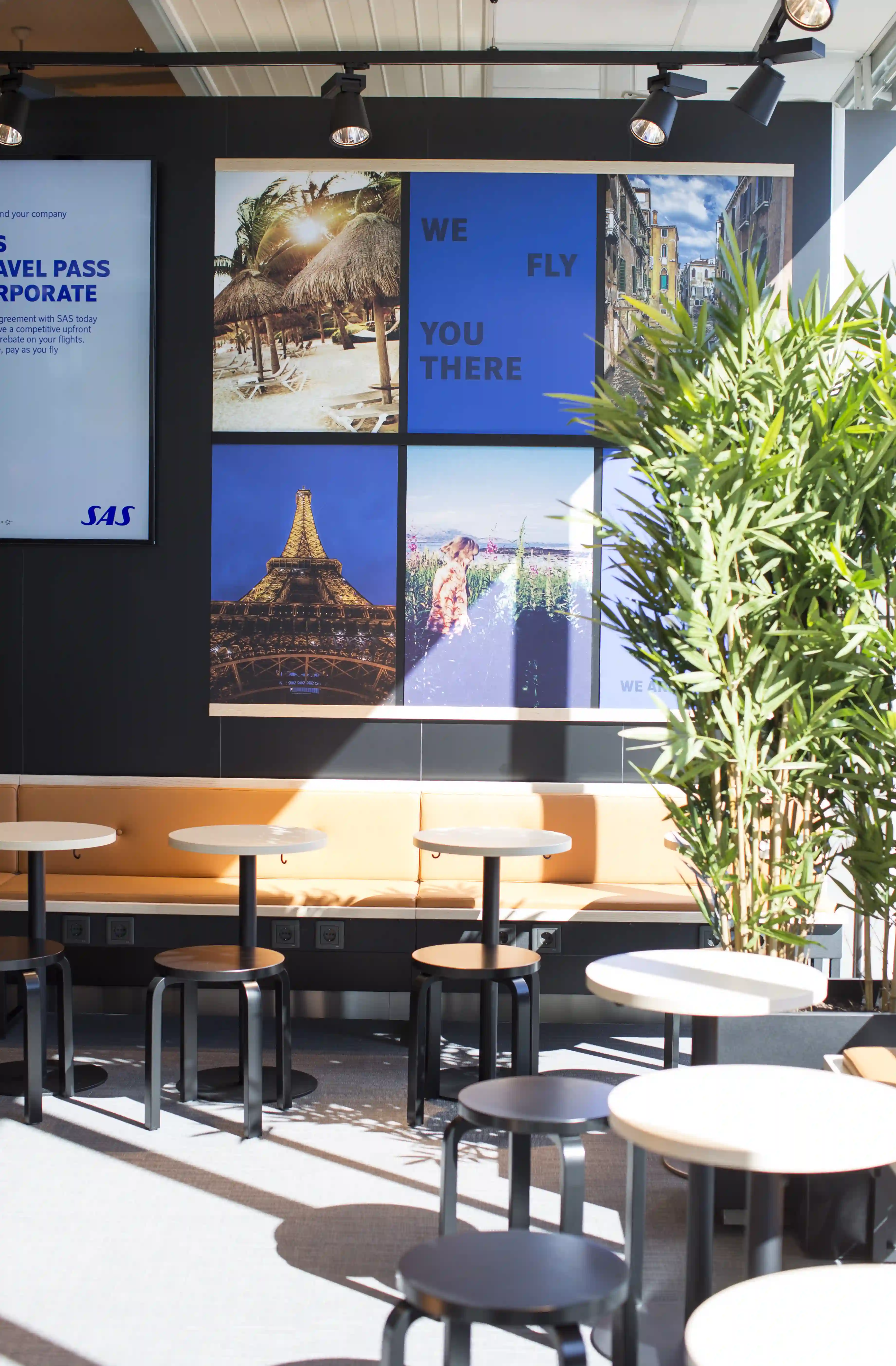
In a noisy, chaotic world, the true value of Scandinavia is its calm. Interviews revealed that travelers didn't want more "shouting" from the brand; they wanted visual silence. They associated "Scandinavian" with breathing room, natural materials, and simplicity—assets SAS was underutilizing in favor of generic corporate blue.
Our strategy was to treat the entire travel arc—from the first click on the app to the final sip of coffee at 30,000 feet—as a single, unified service retail environment. As a top-tier retail design agency in Sweden, we know that great retail is about flow.
We pivoted the brand positioning from "The Business Airline" to "The Airline for the Experienced Traveler." This allowed us to deploy a "high-tech, high-touch" strategy. We utilized technology to strip away the boring administrative tasks (check-in, tagging bags) so that the human interactions could be warmer and more meaningful. We aimed to democratize the premium feel, using design to make economy feel smarter and business class feel more human. It was about creating a "Service Retail" playbook that functioned as a living, breathing ecosystem.


This is where the magic happened. We moved away from the sterile, industrial aesthetic typical of airports and introduced a warm, domestic sensibility.
We reconfigured the land-side experience to mimic the efficiency of a well-planned self-checkout but with the elegance of a hotel lobby. By implementing state-of-the-art self-serve bag drops and check-in towers, we removed physical barriers. This "unmanned retail" approach reduced queues, allowing staff to roam freely and assist passengers, changing the dynamic from "processing" to "hosting."
You can’t fake Nordic authenticity. We utilized a palette deeply rooted in nature: light ash woods, slate-toned stones, and textiles that beg to be touched. In the cabins and lounges, we replaced synthetic, shiny surfaces with matte finishes that absorb light rather than reflecting it. Sustainability wasn't a buzzword; it was woven into the carpets and seat fabrics, reducing weight (and fuel consumption) while increasing comfort.
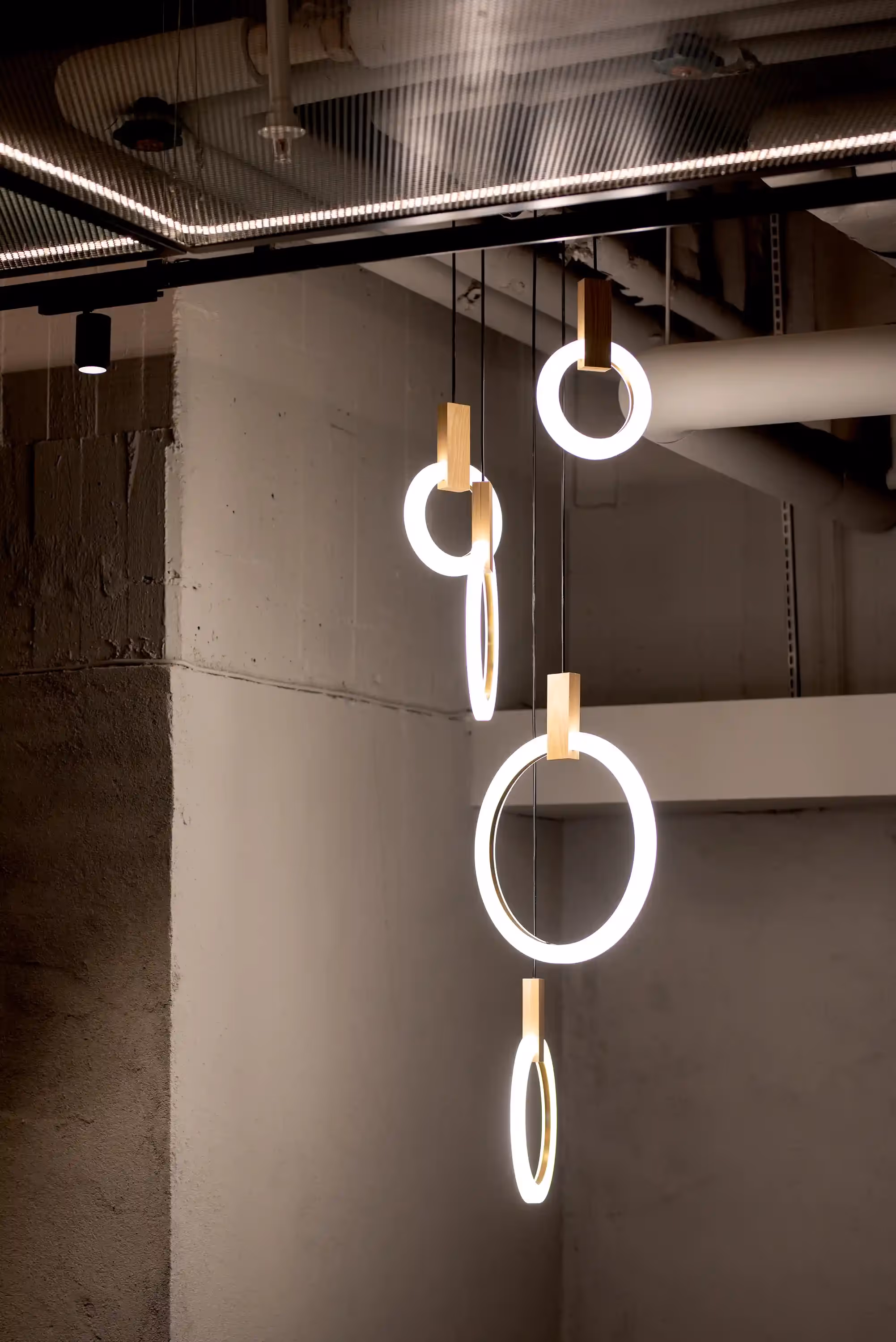
Lighting is the unsung hero of store interior design specialists. We developed a lighting concept that shifts with the phases of the journey. Crisp, cool light at the self-service kiosks to encourage efficiency and clarity; warmer, amber tones in the lounges and cabins to induce relaxation. It creates a subconscious signal to the brain: "You are safe. Relax."
We redesigned the digital interface to mirror the physical signage. The font, the tone of voice, and the visual hierarchy on the mobile boarding pass match the wayfinding in the lounge perfectly. The "Informal Tone of Voice" we developed—friendly, witty, and direct—replaced the robotic "airline speak," making the app feel like a helpful travel companion rather than a gatekeeper.
We treated the lounges as flagship stores. Instead of rows of identical seats, we created micro-zones: social hubs for networking, quiet nooks for reading, and dining areas that showcase Nordic cuisine. It’s retail concept design in the Nordics at its finest—functional yet deeply cozy (hygge).
Implementing a redesign for an airline is infinitely more complex than a static shop fit-out. As a European retail design studio, we had to coordinate across borders, safety regulations, and digital platforms. The rollout included the complete overhaul of the digital ecosystem (app and website), the physical retrofitting of check-in areas across major hubs, and the incremental update of the fleet interiors.
One of the main hurdles was maintaining the "human" feel while deploying heavy automation. We solved this by designing the tech hardware (kiosks and scanners) to look like furniture rather than machinery, encasing them in materials that softened their presence. We also produced a comprehensive Brand Concept Playbook to ensure that whether a passenger is in Stockholm or Chicago, the SAS soul remains intact.
The timeline was aggressive. Concept to opening in under eight months, coordinating across Swedish design direction and Czech build partners. We solved dozens of small problems — acoustics in the yellow rooms, flexible power for moving tables, ensuring the candy machine could be restocked without disrupting flow.

Streamlined Flow: The adoption of self-serve technology drastically reduced check-in wait times, increasing throughput during peak hours.
The transformation has been nothing short of spectacular. By behaving less like a utility and more like a lifestyle brand, SAS successfully repositioned itself.
Travelers noticed the shift immediately. One passenger, Emily M., noted, "Sleek Scandinavian design created a sleek and calming ambiance throughout the journey. I felt like I was truly experiencing the essence of Scandinavia."
By reconnecting with their roots and trusting Blink, their chosen retail design agency in Sweden, SAS didn't just update their look; they future-proofed their business model for the modern traveler.
richard@blinkthedesignagency.com
+46 73 545 5018
Blink is a leading retail design agency based in Sweden, specializing in retail concept development, store experience design, and omnichannel integration across the Nordics and Europe. We transform brands into physical destinations that drive both emotional connection and commercial performance.

.avif)